Cool Summer
Color Palette
Cool Summer is the most purely cool sub-season in the Summer family: a palette of calm blues, dusty pinks, soft purples, and muted neutrals, all unified by a cool blue undertone and a medium depth of contrast.
Of the three Summer sub-seasons — Light Summer, Soft Summer, and Cool Summer — Cool Summer sits at the coolest end of the undertone spectrum and carries a medium contrast level. That means the palette is not as airy and light as Light Summer, and not as deeply muted as Soft Summer.
Colors are crisp enough to hold their own in an outfit, but never sharp enough to compete with the high contrast of a Winter palette. If you have been told your season is Cool Summer (or True Summer, which is the older name for this type), the swatches below are your palette.
The Complete Cool Summer Palette
28 curated specimens grouped by color family
Color Family: Blues
Ice Blue
#D1E4F0
Powder Blue
#A8C6DB
Periwinkle
#8B9FC8
Wedgewood Blue
#5A7D96
French Blue
#4068A0
Slate Blue
#5E6E8A
Cool Navy
#1C3455
Color Family: Pinks
Cool Blush
#EAC0CC
Dusty Rose
#C898AE
Mauve
#B88CA8
Berry
#C06088
Orchid
#C475A4
Fuchsia
#C83878
Color Family: Purples
Lilac
#C8A8D8
Soft Lavender
#B89CCE
Wisteria
#A080C4
Violet
#785AA0
Plum
#68407A
Color Family: Neutrals
Soft White
#ECF0F5
Pearl
#E8E5F0
Cool Gray
#9AA4B0
Silver Gray
#B0B8C5
Blue-Gray
#708090
Greens
Seafoam
#80AEAD
Cool Sage
#8EA49A
Teal
#3C8088
Reds & Berries
Cranberry
#B03458
Burgundy
#752B48
What "Medium Contrast" Means for Cool Summer
Every Cool Summer color shares three qualities: a cool (blue-based) undertone, a medium depth of lightness or darkness, and a chroma that is gently softened—never vivid, never completely greyed out.
| Quality | Cool Summer | Soft Summer | Light Summer |
|---|---|---|---|
| Undertone | Strongly cool | Moderately cool | Lightly cool |
| Depth | Medium | Medium–soft | Light |
| Chroma | Gently muted | Deeply muted | Slightly muted |
In practical terms, medium contrast means a powder blue blouse with cool navy trousers reads as polished and intentional—the contrast is there but not stark. Stark black paired with pure white tips into Winter contrast and can overpower the season. A very deep cool navy paired with soft white is the Cool Summer equivalent.
How to Check a Color Against the Palette by Eye
Step 1 — Undertone Check
Hold the color next to a warm reference (a golden yellow or a warm terracotta) and a cool reference (a clear sky blue or a lavender). If the color looks more harmonious next to the cool reference, the undertone is cool. If you see any warmth in the base, set it aside.
Step 2 — Depth Check
Cool Summer colors are medium in depth. Hold the candidate next to Ice Blue (#D1E4F0) and Cool Navy (#1C3455) from the palette. A Cool Summer color sits clearly between those two poles—neither the lightest nor the darkest.
Step 3 — Chroma Check
Cool Summer colors are gently softened—they have a little grey mixed in, but are not fully greyed. Compare to Periwinkle (#8B9FC8) and Berry (#C06088). A color that matches their saturation—present but not vivid—fits the palette.
Outfit Combinations Using Cool Summer Shades
Curated Ensembles for Daily Life
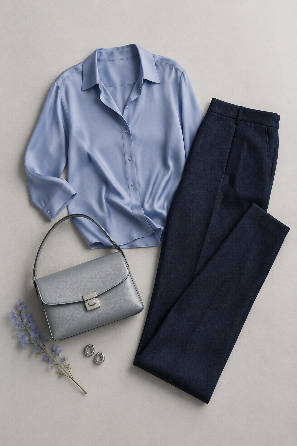
Polished Blue Depth
Periwinkle blouse + Cool Navy trousers + Silver Gray accessories. The perfect medium-contrast anchor.
Dusty Tonal Harmony
Mauve dress (#B88CA8) + Dusty Rose cardigan (#C898AE) + Pearl earrings. Luxury at adjacent value steps.
Cool Monochromatic
Powder Blue top (#A8C6DB) + Slate Blue trousers (#5E6E8A) + Cool Gray shoes (#9AA4B0). Minimalist blue story.
Cool Complementary Contrast
Berry turtleneck (#C06088) + Soft Lavender skirt (#B89CCE) + Silver Gray belt. Creative statement looks.
Professional Cool
Cool Sage blazer + Wedgewood Blue shirt + Cool Navy trousers. Corporate leadership with a natural depth progression.
Confirm Your Season Before Building Your Wardrobe
Color analysis works when the season is right. Cool Summer and Soft Summer are often confused due to their shared cool undertones—the distinction is chroma. Tone & Fit's color analysis reads your undertone, value, and chroma from a single photo using computer vision and AI.
Ready for a precise measurement?
Or try the free color analysis tool in your browser.
Frequently Asked Questions
What is the difference between Cool Summer and True Summer?
+
Can Cool Summers wear black?
+
What metals work for Cool Summer?
+
How do I find my sub-season?
+
Explore More Seasons
Know your palette. Wear your colors.
The free scan takes 30 seconds. No account, no subscription — just your exact color season and a palette built for you.