Light Spring Color Palette:
Warm, Delicate Shades
Light Spring belongs to the warm, clear Spring family. Its colors are light, warm, and gentle, and they work best when they stay soft rather than heavy. Here is what the palette looks like, why it reads warm, and how to test a color against it yourself.

Free to start. No account needed for the scan.
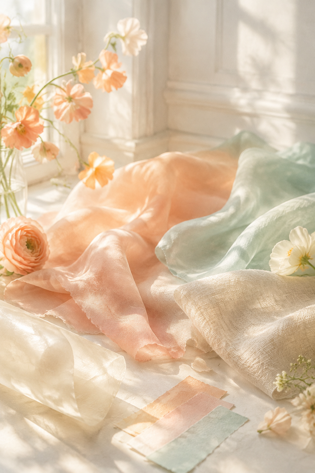
The Light Spring palette at a glance
Tone & Fit describes Light Spring with four traits. Undertone is warm, neutral-warm. Value is light. Chroma is medium. Contrast is low, so hair, skin, and clothing blend more softly than in higher-contrast seasons.
Use these four traits as your reference when a color looks right on paper but wrong on you.
Light Spring swatches with hex codes
The Light Spring palette has ten statement shades and five neutrals. Each swatch below lists its name and hex code, so you can copy the value into a design file or compare it with a paint chip.
Statement shades
Neutrals
Peach, apricot, and buttercream carry the warmest notes. The aqua, mint, and lilac shades show how the palette stays clear without turning cold.
Why Light Spring colors read warm and gentle
Warm undertone
Light Spring shades lean toward yellow, peach, and golden tones. Next to them, skin often looks clearer and more even.
Light value
The colors are lighter than the deep shades of the autumn and winter families, so they feel airy rather than heavy.
Clear but not sharp
Chroma sits at medium. The colors look fresh and bright without the high intensity of a bright palette.
When a shade feels gentle and warm at the same time, it is usually doing what this palette does best.
How to compare a fabric or paint chip against Light Spring by eye
You do not need an app to test a color. Work through these steps with a fabric swatch, a paint chip, or a printed page:
- 1
Stand near a window in daylight. Avoid yellow indoor lamps, which change how warm colors look.
- 2
Hold the fabric or chip next to your face, under your chin, and look in a mirror.
- 3
Lay a Light Spring swatch from section 3 beside the fabric or chip on a plain white sheet.
- 4
Ask three questions: Does it look warm next to the swatch? Does it look light enough? Does it look clear rather than gray?
This method works for any shade, and it teaches you to judge color by what it does to your face instead of its name.
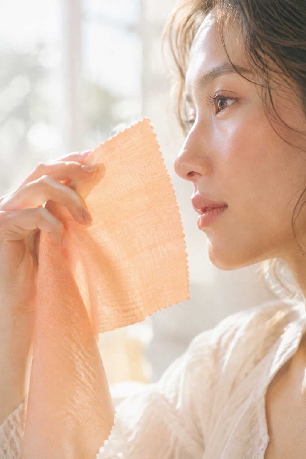
Outfit and makeup combinations
The palette works best when the pieces stay in the same warm, light family, so the whole look reads as one.
Pair a Peach or Apricot top with Light Camel or Warm Ivory trousers. The look stays low in contrast and easy to wear.
Keep a neutral base such as Champagne or Soft Tan, then add one clear accent from the Warm Aqua or Soft Mint family.
Choose Shell Pink or Warm Pink with Buttercream or Warm Ivory. Add a warm metal accent for a softer finish.
For makeup, keep lip, blush, and eye shades in the same warm, light range. Shell Pink, Warm Pink, and Peach work as a set for soft daytime looks.
Outfit color combination generatorA quick check for Light Spring
Run these three checks in daylight. If most of them point the same way, Light Spring is worth testing with a full analysis.
- Undertone
Do warm shades such as Peach or Apricot flatter you more than cool shades such as icy blue or bright pink?
- Value
Do light shades such as Warm Ivory or Champagne look better on you than deep shades such as navy or black?
- Chroma
Do soft, clear colors look better than very bright or very muted ones?
For a full result from one photo, the free color season checker returns a season without an account. Photos are analyzed and then discarded.
Check your season freePreview Light Spring on your own photo
The Tone & Fit iPhone app can drape all twelve palettes over your own photo, so you can compare Light Spring with neighboring seasons before you choose. Color Draping is part of the full app unlock.
 Color Draping Tool
Light Spring palette questions
1. What is the difference between Light Spring and Light Summer?
Light Spring sits in the warm, clear Spring family. Light Summer sits in the cool, soft Summer family. Light Spring leans toward peach, apricot, and golden tones, while Light Summer leans toward cool pastels.
2. Can I check Light Spring colors without an app?
Yes. Compare a fabric or paint chip with a Light Spring swatch in daylight, next to your face, using the manual steps provided in section 5.
3. Are Light Spring colors good for makeup?
They work well for soft daytime makeup. Choose lip, blush, and eye shades from the warm, light range, such as Peach, Shell Pink, and Warm Pink.
4. How do I know if I am a Light Spring?
Start with the three quick checks in section 7, then take a full analysis with a single photo. The free checker returns a season without creating an account.
5. Does the app store my photo?
Tone & Fit analyzes the photo and then discards it. Photos are not stored, not used to train models, and not shared with advertisers.
6. Is the app free to use?
The scan is free and needs no account. The full palette and premium tools are part of the paid unlock.
Find your season with one selfie
Tone & Fit reads undertone, value, and chroma from one photo in about 30 seconds, then gives you a 12-season palette. No account is needed for the free scan.