What Is the Spring Color Palette?
The Spring color palette is the warm-and-clear family within the four-season and twelve-season color analysis systems. Every Spring season shares two defining qualities: a warm (golden-yellow) undertone and clarity — colors that read bright and clean rather than soft, dusty, or muted.
The Spring family contains three sub-seasons:
- Light Spring — warm but gentle; the lightest-value Spring
- True Spring — the purest, most archetypally warm-and-clear Spring
- Bright Spring — the most vivid Spring; clarity pushed to its highest level
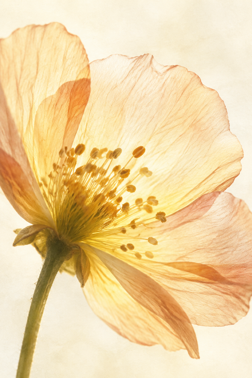
What unifies all three is the absence of grey or ash. Spring colors glow. They look fresh, sun-lit, and distinctly warm. The palette spans from ivory and peach through coral and apple green, with a clear, almost translucent quality throughout.
The Full Spring Swatch Set
The swatches below represent the core Spring color family — shades shared across the sub-seasons. Each chip is a curated specimen of the Spring light.
Light Spring: Soft and Warm
Light Spring is the most delicate of the three Spring seasons. The palette shares Spring's signature warmth but dials the value up (lighter) and the saturation down — colors are gentle, airy, and luminous.
What works: Creamy whites, soft peaches, light warm yellows, dusty rose, warm powder blue, soft warm greens, camel, warm light neutrals.
What to avoid: Deep jewel tones, black, cool greys, icy whites — these overwhelm Light Spring's gentle contrast level.
True Spring: Warm and Clear
True Spring — sometimes called Warm Spring — is the purest, most quintessential Spring season. This palette is fully warm, clear, and medium-value: the colors look bright and sun-saturated, not muted or pale.
What works: Warm peach, coral, golden yellow, clear turquoise, apple green, camel, terracotta, warm ivory — shades that look as if they're lit from within.
Bright Spring: Vivid and Clear
Bright Spring sits at the intersection of Spring and Bright Winter: it keeps Spring's warmth while borrowing the high contrast and saturation of Winter. These colors are the most vivid of any Spring sub-season.
What works: Vivid corals, hot pink, clear bright yellow, electric green, bright turquoise, clear cobalt blue, vivid orange — colors with punchy, high-definition energy.
What "Warm" and "Clear" Mean on Skin and Fabric
The words "warm" and "clear" describe two independent color dimensions — and Spring is the only family that scores high on both at once.
What "warm" means
A warm color has a yellow or golden bias in its undertone. On skin, warm colors harmonize with peachy, golden, or olive skin undertones. On fabric, a warm white looks cream or ivory beside a cool white.
What "clear" means
Clear means saturated and unmuted — the color has been mixed without grey or brown. Clear colors appear bright, clean, and alive. On skin, clear colors reflect well next to Spring coloring because they match the natural brightness of Spring skin.
Spring Palette Pairing Examples
These outfit color pairings are built entirely from the Spring palette and work across all sub-seasons at their respective intensity levels.
Warm Neutrals Base
A clean, relaxed foundation. Layer in a coral or peach accent piece to lift the combination.
Fresh Contrast
The warm coral advances while the soft blue recedes — a classic Spring contrast.
Tonal Spring Energy
Nature-fresh and vivid; best for True Spring and Bright Spring types.
Earthy Warmth
Grounded and warm; the mint cools just enough to keep the terracotta from reading autumnal.
Which Spring Sub-Season Are You?
Take Tone & Fit's free color analysis — available in the browser or on iPhone. One photo, 30 seconds, a 12-season result with your personal palette.

Frequently Asked Questions
What colors are in the Spring color palette?
What are the three Spring sub-seasons?
Can Spring wear black?
What is the difference between Spring and Autumn palettes?
Explore More Seasonal Color Palettes
Know Your Season.
Wear Your Best Colors.
Tone & Fit's free color analysis identifies your exact season from one photo in around 30 seconds. No account needed.
Coming soon on Android