Seasonal Color Palettes

The Soft Summer Color Palette

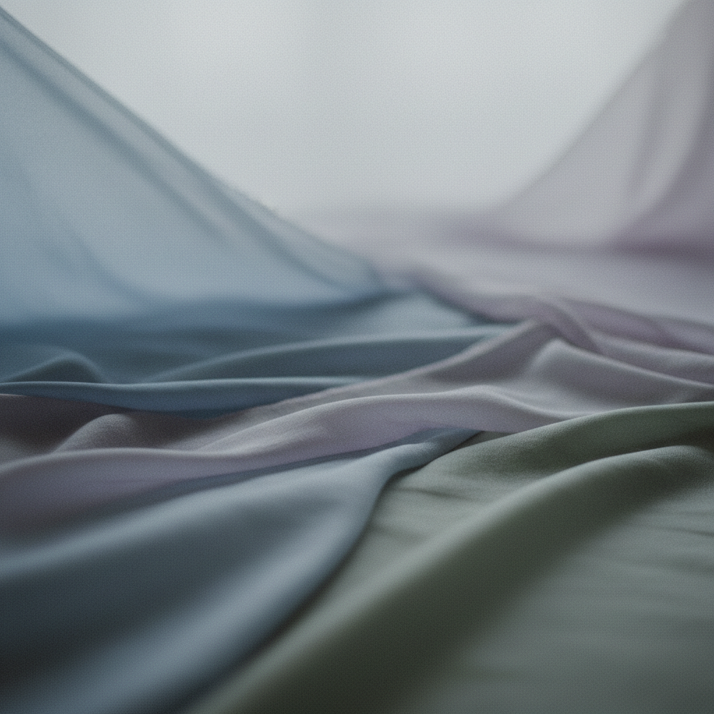
Soft Summer sits in the cool, muted corner of the 12-season system — a place where blues lose their edge, pinks go dusty, and greens fade to sage. Every shade in this palette is held back by grey, and that restraint is exactly what gives the palette its quiet authority.

What makes a color Soft Summer?

Soft Summer is one of three Summer sub-seasons defined by a cool undertone and low chroma. The colors are greyed down, muted, and desaturated. They never pop.
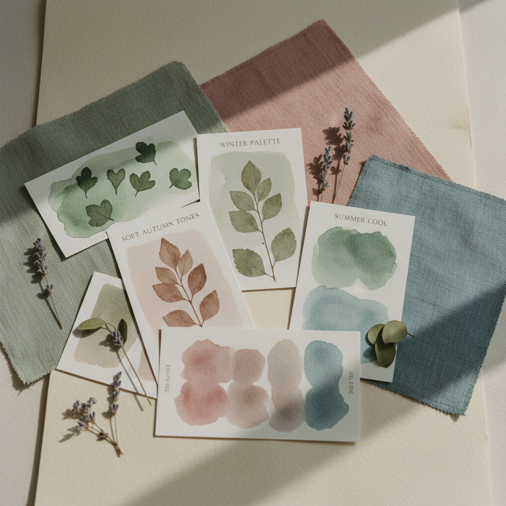
Editorial botanical color study

Professional color analysis measures three dimensions:

  • •Undertone: Cool (blue-based). Soft Summer shares this with all Summer seasons. Warm yellows and oranges don't belong here.
  • •Value: Medium. Soft Summer is neither the palest Summer nor the darkest. Shades land in the middle range — not stark white, not true black.
  • •Chroma: Low. This is the defining trait. Every color has grey mixed in. Vivid, saturated versions of any color look harsh against a Soft Summer complexion.

The Soft Summer Palette — Swatches and Hex Codes

Blues and Blue-Greys

Dusty Blue

#7B9BAD

Steel Blue

#6E8FA3

Blue-Grey

#8497A8

Dusty Pinks and Mauves

Dusty Rose

#C4909A

Muted Mauve

#B8899A

Ash Pink

#C9A4AD

Lavenders and Sage

Muted Lavender

#A89DB8

Soft Sage

#9CAD96

Neutrals and Anchors

Soft White

#EDE8E0

Soft Charcoal

#6A6E72

Muted Navy

#4A5E6E

Soft Burgundy

#8C6068

Core Palette Groups

Blues and blue-greys are the backbone of Soft Summer. Think of the color of fog over water, or a lake on an overcast day. These aren't saturated teals or vivid cobalt — they're versions of blue that have been mixed with grey until the intensity drops.

Dusty pinks and mauves provide a muted warmth that leans pink rather than peach. Dusty Rose and Heather capture this well: pinks that feel settled rather than vibrant, as if they've been washed a few dozen times.

Lavenders naturally combine cool undertones with the required low chroma. A purple that's been softened with grey reads as Soft Summer almost by definition.

Sage greens bring a naturalistic, dried botanical quality. Soft Sage is perhaps the easiest color in the palette to build an entire wardrobe around.

Neutrals avoid pure black and white. Soft White has the faintest warmth without being cream; Soft Charcoal is the deepest the palette comfortably goes without introducing harsh contrast.

Colors that don't belong in Soft Summer

Two problems push a color out of range:

  • 1. Too Bright

    Vivid, saturated versions of otherwise cool colors — electric blue, hot pink, bright violet — overwhelm a Soft Summer complexion. Cobalt blue and fuchsia fall outside the range regardless of their undertone.

  • 2. Too Warm

    Earthy oranges, golden yellows, terracotta, and warm browns carry a yellow-orange base that conflicts with the blue-cool undertone of Soft Summer. Camel and rust feel dissonant on Soft Summer coloring.

  • 3. Extreme Contrast

    Stark white and true black create contrast levels the palette doesn't support. Pure white reads too stark; true black too harsh.

How to use the Soft Summer palette

In clothing, focus on tonal, low-contrast combinations like sage green with soft lavender. Every piece should feel equally muted to maintain the palette's quiet harmony.

In makeup, choose foundation with cool undertones and lipsticks in the pink-mauve range. Eye looks in soft slate or grey-violet bring out the eyes without introduce harsh contrast.

In hair and metals, ash blondes and cool medium browns are ideal. Metals should be silver or white gold; avoid yellow gold which tends to read too warm against the cool skin undertone.

Not sure if you're Soft Summer?

Knowing the palette is only half the answer. Tone & Fit measures your undertone, value, and chroma from a photo — giving you a personal result in seconds.

Free scan, no account, no subscription.

Confirm your season

It is easy to confuse Soft Summer with Light Summer (which is lighter and less grey) or Cool Summer (which is clearer and more saturated). Tone & Fit uses computer vision to map your photo directly to the 12-season system for an accurate result.

Frequently asked questions

+What is the Soft Summer color palette?
Soft Summer is a sub-season in the 12-season color analysis system. Its palette is made up of cool-undertoned, medium-value, low-chroma colors — shades that lean blue or grey-pink rather than yellow or orange, and are greyed down rather than vivid.
+Can men have a Soft Summer palette?
Yes. The 12-season system applies to any complexion regardless of gender. Wardrobe implications for men include steel blues, dusty mauves, soft slates, and grey-greens for shirts and jackets.
+What colors should I avoid?
Avoid vivid saturated colors (any color bright enough to pop), warm-undertoned earth tones (orange, rust, golden yellow), and extreme contrast anchors (pure white, true black).

Find out if Soft Summer is your season.

Tone & Fit measures your undertone, value, and chroma from one photo — the three pillars of color analysis. No account required.