The short answer
Build the capsule from your color season's palette, not from a universal list of "capsule neutrals." Choose two or three base neutrals that will cover most of your outfits, add two or three accents from the same palette, and leave everything else optional.
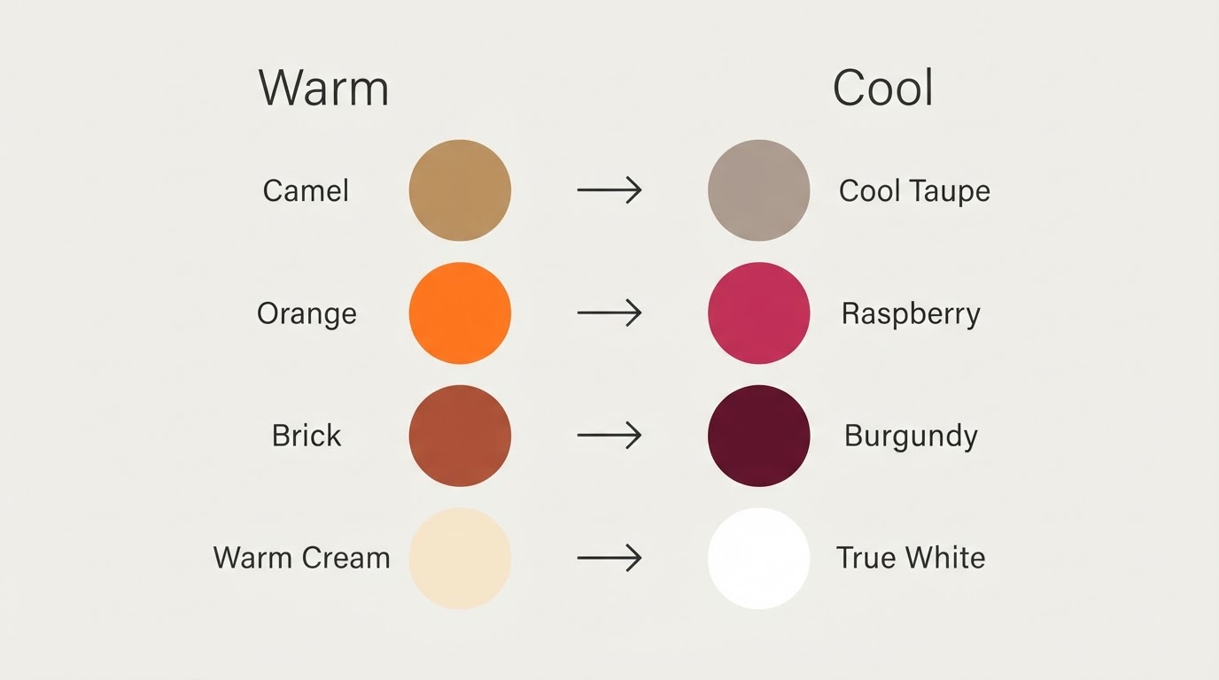
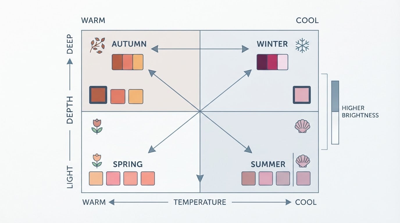
The palette does the matching work in advance. A color season resolves the three variables that make clothes clash — undertone (warm or cool), value (light or deep), and chroma (muted or bright). Two garments pulled from the same palette agree on all three, so they combine without a stylist standing next to you.
That is the whole method. The rest of this guide is the order to apply it in.
Key answers at a glance
Question | Short answer |
|---|---|
What colors belong in my capsule? | Your season's base neutrals plus accents from the same palette. |
How many colors do I need? | Two or three bases and two or three accents cover most outfits. |
What counts as a base neutral? | The quietest shades in your palette — the muted ones with the least contrast against each other. |
What counts as an accent? | The higher-chroma or higher-contrast shades you wear in smaller doses. |
Do sub-seasons change the bases? | Yes. Sub-seasons shift how light, deep, warm, cool, muted, or bright those neutrals should be. |
What if I do not know my season? | Get a verdict first, then build. Guessing is what produces a closet that mostly works and occasionally betrays you. |
How do I shop without mistakes? | Carry the palette, judge colors in daylight, and reject anything that fights the list. |
The five-step framework
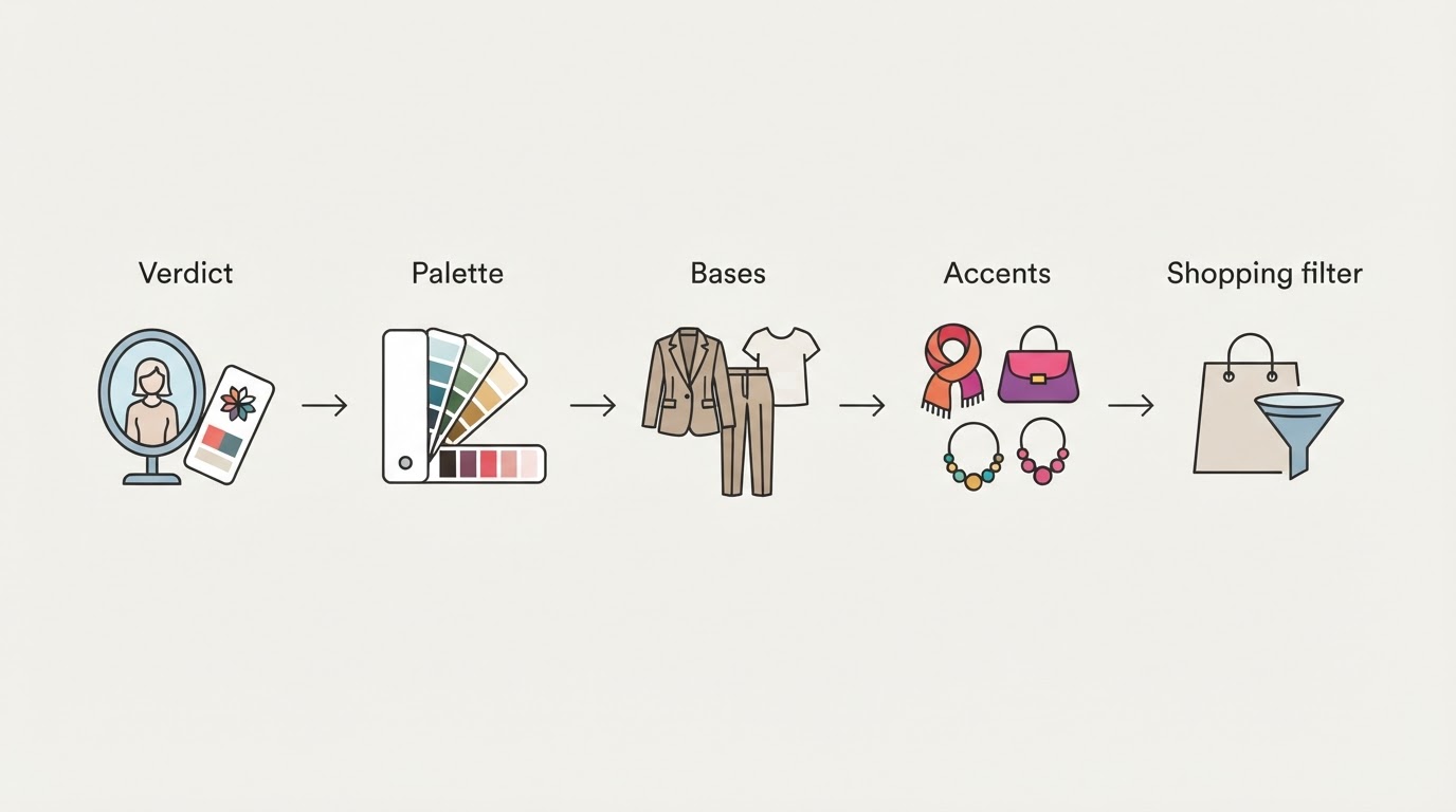
Work in this order: verdict, palette, bases, accents, shopping filter. Each step narrows the next one, so by the time you reach a store you are filtering, not browsing.
1. Get your verdict
A verdict turns color choice from taste into a checklist. You only need to know which of the twelve sub-seasons you match; everything after that becomes mechanical.
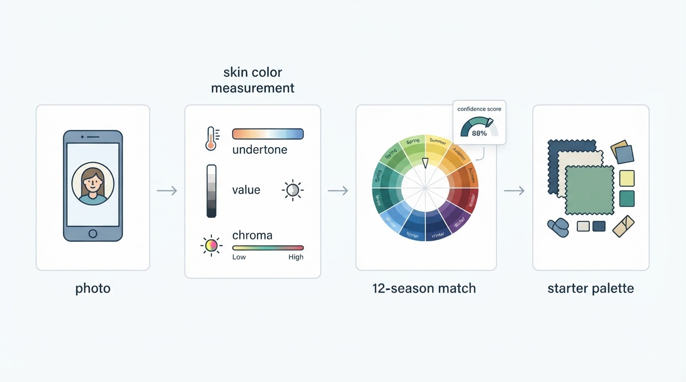
There are two practical routes. In-person draping puts real fabric under your face and is the most thorough option, but it is slow, costs far more than a photo-based scan, and depends on the analyst's eye. A photo-based analysis compresses that same three-pillar check into one upload. Tone & Fit's free browser analyzer reads a single photo in about 30 seconds and returns a season result with a confidence score and five starter colors, without an account, and it flags when warm indoor lighting may have skewed the reading.
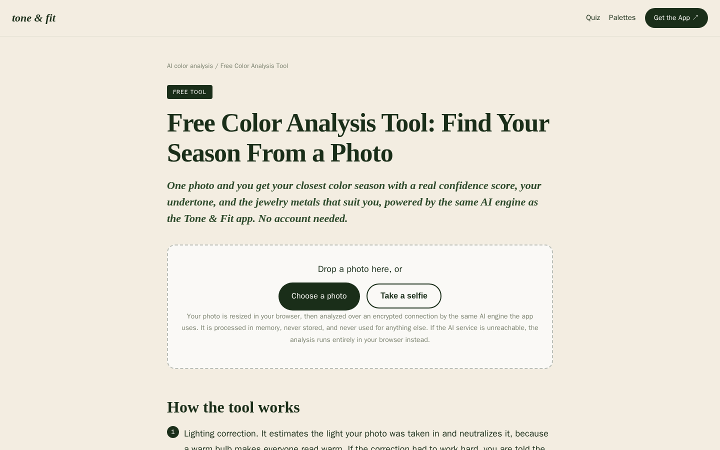
Desktop first-screen of the free web-based color analysis tool with photo upload drop zone, how-it-works steps, and privacy notes
Treat any first verdict as a strong hypothesis rather than a life sentence. Live with the palette for a few weeks, test it against clothes you already love, and re-check if a shade that should work keeps looking wrong.
2. Pull the palette
Your season's full palette is the shopping list. Write it down before you look at a single garment; without it, every item becomes a fresh judgment call.
Concrete swatches beat abstract color names, because "camel" can mean five different fabrics. A palette published with hex codes removes that ambiguity — the 12-season palette library at Tone & Fit lists all 72 swatches with their exact values. Save your sub-season's swatches to your phone and you have a portable reference for every future purchase.
Then mark the list in two passes: the neutrals you will see constantly, and the accents you will see occasionally.
3. Choose two or three base neutrals
Base neutrals are the quietest shades in your palette, and they should cover the largest surface area of your wardrobe: outerwear, trousers, knitwear, shoes, and bags.
Pick them with three filters:
- They sit in the middle of your palette. A base should match your season's temperature and depth without sitting at either extreme, so it pairs with both lighter and deeper accents.
- They mix with each other. Any two bases on the list should look deliberate together, because most mornings you will wear exactly two.
- They repeat across fabrics. Check the shade in wool, cotton, and leather. If it still reads as the same color family, it belongs on the list.
Two bases are enough to start. Add a third when you notice an outfit category — shoes, or outerwear — with no neutral to fall back on.
4. Add two or three accents
Accents carry the personality of the capsule: the sweater that lifts a plain base outfit, the scarf, the bag, the top that makes the whole look intentional.
Choose them from the brighter, deeper, or more saturated end of your palette, and keep the number small. Three accents multiply into dozens of combinations; eight accents simply rebuild the closet you were trying to fix.
Use accents where the eye lands — at the neckline, the wrist, or the shoes. A palette accent in a small dose reads as confidence; the same shade across a full outfit reads as a costume.
5. Apply the shopping filter
The palette filters the store, not the other way around. Shop the list, not the sale rack.
Five checks before anything comes home:
- Compare the garment to your swatches in daylight, near a window, not under warm store lighting.
- Hold the item against your face, not your hand or your arm — the face is what changes.
- Pair it mentally with two of your bases. If it needs a third color to work, it is an exception, not a purchase.
- Ask whether something you already own does the same job in the same palette. If yes, the new item is duplication.
- If the color works but the fit does not, walk away. Color cannot rescue an unwearable cut.

How sub-seasons shift the bases
Sub-seasons keep the family direction and shift how light, deep, warm, cool, muted, or bright the base neutrals should be. The four families set the direction; the sub-season sets the distance.
Family | Neutral character | Illustrative bases | Typical accents |
|---|---|---|---|
Spring | warm, clear, light to bright | ivory, cream, camel, warm stone | coral, leaf green, turquoise |
Summer | cool, soft, light to medium | dove gray, soft navy, taupe, soft white | dusty rose, lavender, soft blue-green |
Autumn | warm, muted, medium to deep | olive, camel, mushroom, chocolate | terracotta, mustard, moss, teal |
Winter | cool, clear, deep to bright | black, charcoal, true navy, pure white | true red, emerald, cobalt, fuchsia |
Inside a family, the sub-season tilts the same palette:
- Spring: Light Spring keeps the bases pale and low-contrast, such as ivory and light camel; Bright Spring pushes the same warmth toward white and clearer brights.
- Summer: Cool Summer keeps the coolest, clearest soft neutrals; Soft Summer pulls everything one step grayer and quieter.
- Autumn: Soft Autumn mutes the bases toward olive and mushroom; Deep Autumn deepens them toward chocolate and dark olive while keeping the warmth.
- Winter: True Winter takes the coldest, clearest neutrals; Deep Winter keeps that cool direction but pushes the values darker, so charcoal, dark navy, and black carry more of the capsule.
Treat these lists as illustrative starting points. The precise set is the one your palette publishes for your sub-season.
Follow-up questions, grouped by intent
These are the questions that come up once you have a verdict, grouped by what you are trying to do.
Getting your verdict
How much should I trust a photo-based result? Trust it as a working verdict, not a final one. The result gives you a confidence score and a repeatable method; your eyes over a few weeks of wearing the palette are the last reviewer.
Do I still need a consultant if I have a result? Not to start. A consultation adds drape-level confirmation — real fabric under your face in controlled light — which matters most for a wardrobe you plan to keep for a decade.
What if two seasons both seem to fit? Wear the stricter of the two palettes for a week and note which shades you reach for. The palette you stop second-guessing is the one that fits.
Building the palette
How do I choose between two shades that are close? Test both near your face in daylight. Keep the one that makes your skin look even and your eyes look clear; the loser becomes a bottom or a shoe, where the match matters less.
Can I keep a color that is outside my palette? Yes, if you keep it away from your face. An off-palette coat or shoe is a lower-risk exception than a collar or a scarf.
Do patterns belong in a capsule? Yes, when the pattern repeats palette colors. A print that contains two of your shades behaves like both of them at once.
Shopping with the palette
How do I stop impulse buys that break the palette? Keep the swatch list on your phone and set one rule: no purchase without a daylight match.
Should I replace my whole wardrobe at once? No. Replace items as they wear out, starting with the pieces worn closest to your face.
FAQ
What colors go in a True Winter capsule wardrobe? True Winter anchors on cool, clear neutrals — black, pure white, true navy, and charcoal — and uses crisp accents such as true red, emerald, cobalt, and fuchsia in smaller doses.
How is a Deep Winter capsule different from a True Winter capsule? Both stay in the cool, high-contrast Winter family, but Deep Winter pushes the base neutrals darker, so charcoal, dark navy, and black do more of the work. True Winter leans on the coldest, clearest values rather than the darkest ones.
Can I build the palette with a free tool? Yes. A free palette library that lists the swatches with hex codes is enough to build your base-and-accent set before you shop. You do not need a paid service to know your colors; you need a list you trust and daylight to test it.
How do I adapt a Deep Winter capsule for summer? Keep the palette and change the fabric, not the colors: lighter weaves, fewer layers, and the same cool neutrals carrying the outfit.
What if black is not in my palette? Use your season's darkest neutral instead — deep olive or chocolate for warm seasons, gray-brown or soft navy for cool, muted ones — and keep black away from your face if you still want to wear it.
Put the framework to work
Write your season at the top of a note, list two or three bases and two or three accents under it, and treat that note as the only color authority for your next purchase. When the list is short and the palette is consistent, a capsule stops being a decluttering project and becomes a filter you can reuse for years.