What colors should fair, cool skin avoid?
Start with the warm earth tones: camel, tan, warm khaki, orange, and brick are the shades most likely to wash out a fair, cool complexion when they sit near your face. Each carries an orange or yellow base, and that base is close to the opposite of the pink-blue cast in cool skin.
The problem is rarely the color family on its own. Temperature matters, and so does position. A camel coat worn open over a cool blue shirt reads very differently from a camel scarf wrapped under your chin. The closer a warm shade sits to your face — scarf, turtleneck, collar, hat, earrings, lipstick, hair color — the more it pushes its own cast onto your skin. A rust skirt, a tan bag, or cognac boots a metre below your jawline are far less likely to be the thing that makes people ask whether you slept badly.
Beyond those five headline culprits, keep an eye on shades built on the same warm base: mustard and butter yellow, warm cream and ivory, cognac and orange-brown leathers, and olive or mossy greens that lean yellow rather than blue. None of them are banned forever, but they are the ones worth testing in daylight before you commit.
Quick answers
Question | Short answer |
|---|---|
Which colors wash out fair, cool skin fastest? | Warm earth tones worn near the face: camel, tan, warm khaki, orange, and brick. |
Can I still wear orange? | Yes, but keep it away from your face or shift to a cooler, redder version such as a blue-based coral. |
Are black and white off-limits? | No. Neither is a warm tone, so neither adds an orange cast; how they read is a question of contrast, not undertone. |
What about beige and cream? | Beige is the classic trap: warm, low in contrast, and close to many fair skin tones, so it can make a face look erased rather than framed. |
Do dark colors count as colors to avoid? | Darkness itself is not the issue, warmth is. Cool deep shades such as navy, charcoal, plum, and burgundy are usually easier than warm browns and olive. |
Does this apply to men? | Yes, and the same rule runs through shirts, ties, knitwear, outerwear, and beard color. |
What if I love camel? | Wear it below the face, or break the line with something cool — a navy scarf, a silver necklace, a blue shirt collar. |
How do I verify any of this? | Test one shade at a time in neutral daylight and watch your face, not the fabric. |
Why warm tones wash out cool skin
Warm colors wash out fair, cool skin because they add a yellow-orange cast to a complexion that already sits on the blue-pink side of the colour wheel. The mismatch rarely reads as an obvious clash. It shows up as sallowness, extra shadow, or a greyish film over the face.
Fair skin tends to make that shift easier to see. There is less natural depth to absorb a strong warm tone, so when camel or mustard bounces warm light back onto your jawline, the difference registers as tiredness or unevenness. Deeper cool complexions often carry a warm accessory more comfortably because the contrast between fabric and skin is smaller. Fair skin gets less of that buffer.
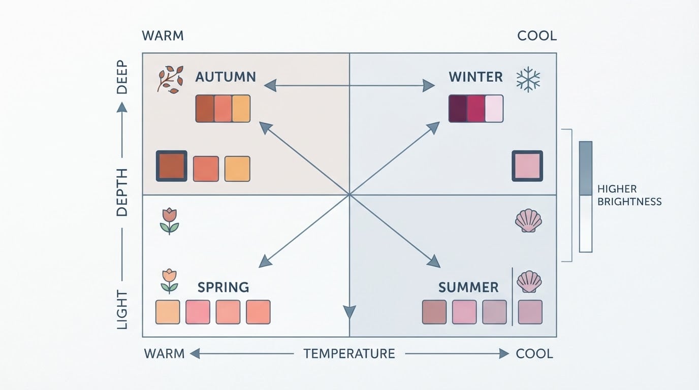
Two people can both be cool and still disagree about the same sweater, because undertone is only one variable. Depth and chroma matter too: a bright pumpkin orange will behave differently on someone who is light and muted than on someone who is deep and bright. Treat every avoid list — including this one — as a hypothesis to test, not a verdict to obey.
Cool-leaning swaps that keep the outfit interesting
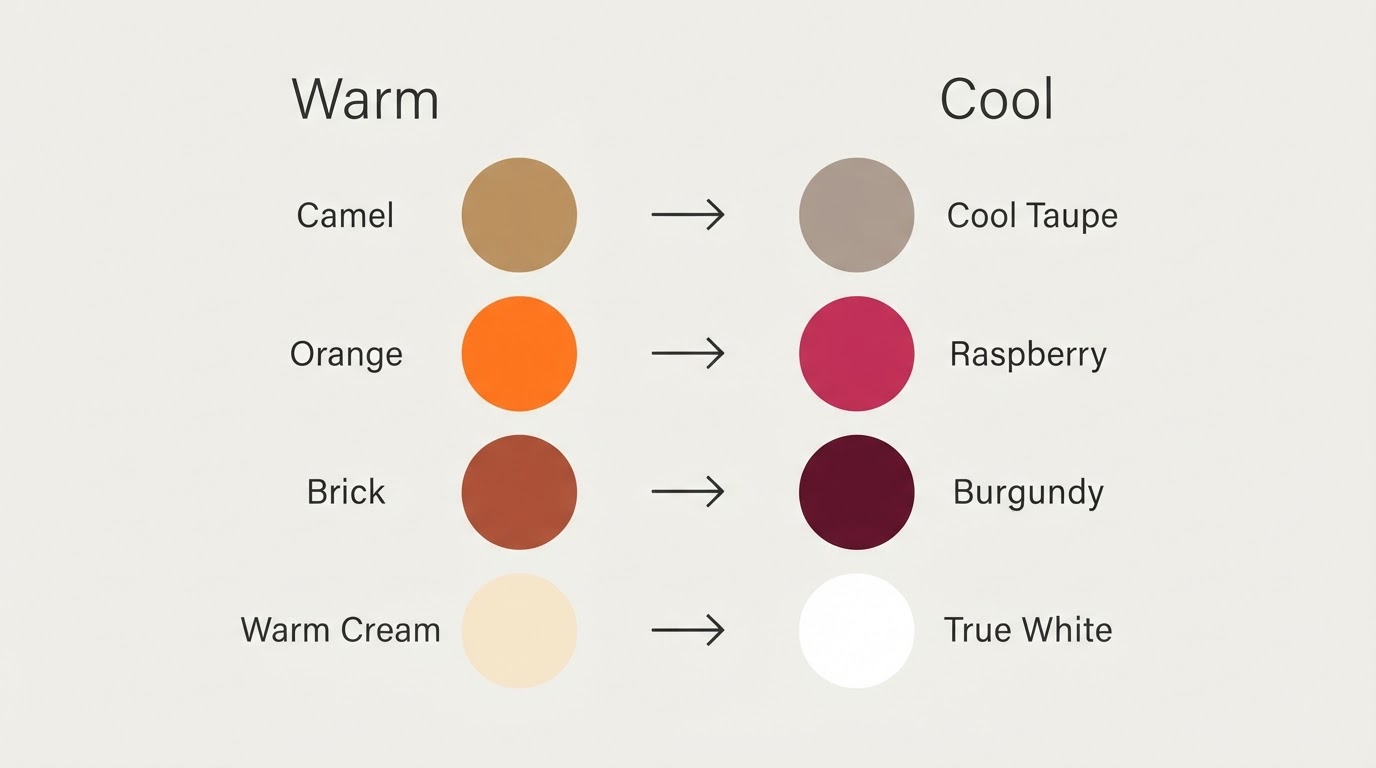
The fastest fix is to keep the shape and value of a color you love and shift it cool. You do not have to strip your wardrobe down to navy and grey; you only have to move the warm shade away from your face or replace it with a blue-based cousin.
Instead of | Try |
|---|---|
Camel | Cool taupe or greige |
Tan | Stone or dove grey |
Warm khaki | Slate or a blue-leaning olive |
Orange | Raspberry, cranberry, or blue-based coral |
Brick or terracotta | Burgundy or a true red with a blue base |
Butter yellow | Soft cool yellow or pale lemon |
Warm cream or ivory | True white or cool pearl grey |
Cognac leather | Black, charcoal, or a cool espresso brown |
Two rules make the swaps work. First, match the value: if you are replacing a light camel with a light grey, the outfit keeps its balance and the change stays honest. Second, change one variable at a time. Keep the cut, the texture, and the rest of the outfit the same so the only thing you are judging is the color.
Follow-up answers by intent
Most follow-up questions land in three places: hair, men's wardrobes, and dark colors. The short answers below stay on the same principle — warmth near the face is what causes the problem, not the colour's name.
Hair
Warm hair color creates the same near-face problem as a camel scarf. If you are fair and cool, ask for ash, cool brown, or cool blonde tones rather than golden, honey, or copper ones, and keep the warmest tones away from your roots and face-framing pieces. If your hair is already warm, a cool-toned gloss or a cooler toner can soften the contrast without a full recolor.
Men's wardrobes
For fair, cool men, the workhorses are cool-based classics: navy and charcoal suiting, true white and pale blue shirts, burgundy and deep green ties, and cool grey knitwear. Warm tan and camel jackets, mustard ties, and yellow-leaning olive pieces are the ones to keep away from the collar line. The same test applies to beard color, where cool ash and neutral browns tend to sit more quietly against cool skin than red or orange-brown tones.
Dark colors
Dark is not the enemy; warm is. Black, navy, charcoal, deep plum, and burgundy are cool or neutral enough to work on many fair, cool complexions, and they often deliver the crisp contrast that light skin handles well. The darks to treat with care are the brown-based ones — chocolate, cognac, and warm espresso — especially when they wrap the neck as a scarf, collar, or turtleneck.
Where avoid lists go wrong
Most avoid lists fail for four predictable reasons. The first is treating a color as permanently banned instead of position-dependent: a shade that fights your face can be excellent in a skirt, a bag, or a shoe. The second is copying someone else's list. Two cool-toned people can have different depth and chroma, so a shade that flattens one face can lift another. The third is testing in the wrong light. Warm bulbs and changing-room mirrors push everything yellow, which makes every warm shade look worse and every cool shade look better than it will at home. The fourth is judging the fabric instead of the face. The fabric is not the outcome; your skin's response to it is.
How to check any avoid list against your own face
Test the list in neutral daylight, one color at a time, and watch your face rather than the fabric. Stand near a window, hold the item under your chin, and compare it with a cool control colour you already know works — navy or true white usually does the job.

Look for three signals: your jawline looks more even, the shadows under your eyes soften, and your skin reads pinker or clearer rather than yellow or grey. If the opposite happens, the colour is fighting you in that position. Repeat with the same colour somewhere else — belt, trousers, shoes — because many "avoid" shades are perfectly wearable once they stop framing your face. When the check is ambiguous, a second opinion helps: a friend in the same daylight, or a quick unfiltered photo, gives you a baseline that a changing-room mirror will not.
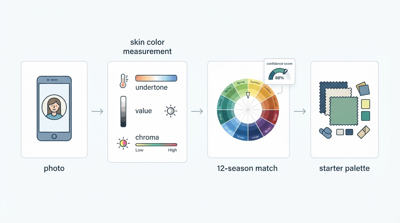
If you want a faster starting point, a selfie-based analyzer can narrow the field before you drape anything. Tone & Fit's free browser tool is one example: you upload a photo, it corrects for lighting, measures undertone in CIELAB color space, and returns a season call with a confidence score — no account needed. The photo is resized in the browser and never stored, so you can try it casually, and when a warm indoor bulb skews the reading, the tool flags the lighting problem instead of hiding it. Treat the verdict as a hypothesis and then confirm it with the daylight test above; the point of a confidence score is to tell you how much weight to put on a single answer.

Desktop first-screen of the free web-based color analysis tool with photo upload drop zone, how-it-works steps, and privacy notes
FAQ
Will cool skin really look bad in every warm color? No. Position, depth, and chroma all change the outcome. The five headline shades are simply the ones most likely to wash out a fair, cool face when they sit close to it.
Does makeup count as a near-face color? Yes. Lipstick, blush, and foundation undertones sit on your skin rather than a hand's width away, so a warm orange lip or a golden foundation is often more visible than a warm sweater.
Should I throw out the warm pieces I already own? No. Move them away from your face, pair them with a cool layer, or keep them for days when you want a deliberately warm, sunlit look.
How do I know whether I am actually cool? Compare your skin against a warm and a cool neutral in daylight: cool skin tends to look clearer next to blue-based tones and slightly yellow or shadowed next to orange-based ones. If the answer stays unclear, a photo-based analysis with a confidence score can give you a starting point.
The short version
The core list is short: keep camel, tan, warm khaki, orange, and brick away from your face, and treat the same warm base as a caution flag everywhere else in your wardrobe. Your cool swaps — taupe, stone, raspberry, burgundy, navy, plum, true white — do a similar job with less friction. Above all, remember that an avoid list is an opening hypothesis. Test it on your own face, in your own daylight, and let your skin tell you which shades stay.