How the 12-Season Chart Is Organized
Most people meet color analysis as four seasons: Spring, Summer, Autumn, and Winter. The 12-season system keeps those four families and splits each one into three sub-seasons. That produces twelve labels, and each label is a position on a map rather than a rigid type.
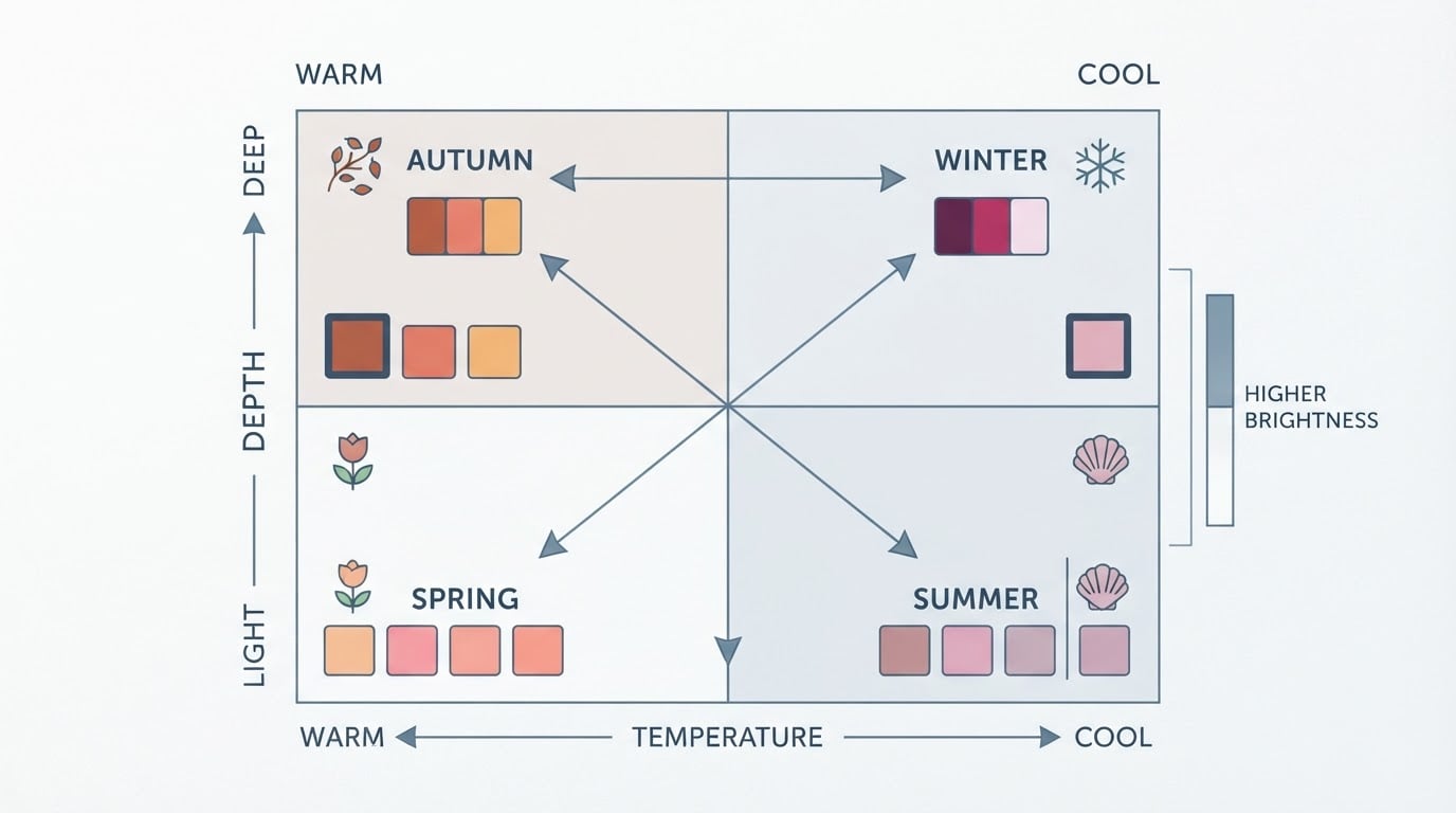
Every sub-season sits at the intersection of three variables: undertone, value, and chroma. Undertone is the warm (golden, peachy, olive) or cool (blue, pink, ashy) cast of the skin. Value is how light or deep the overall coloring reads. Chroma is how clear or muted it looks — a polished gemstone against a dried leaf.
The four families fix the first variable. Spring and Autumn are warm families; Summer and Winter are cool families. The three sub-seasons inside a family share that undertone and then shift the other two variables. Typically one leans lighter or softer, one sits at the center of the family, and one leans deeper or brighter. That is why the closest neighbor of almost every sub-season sits inside the same family — and why neighboring labels usually differ by a single step on one axis.
The 12 Sub-Seasons at a Glance
Use the chart below as a map of the system. For each sub-season, the final column names the closest neighbors and the one variable that separates them.
Family | Sub-season | Dominant traits | Closest neighbor and the key difference |
|---|---|---|---|
Spring | Light Spring | Warm undertone, light value, low-to-medium contrast, gentle clarity | Light Summer — same lightness, cool undertone. Warm Spring — one step deeper and more saturated. |
Spring | Warm Spring (True Spring) | Fully warm golden undertone, medium value, medium-high chroma | Light Spring — paler and softer. Bright Spring — more vivid with higher contrast. |
Spring | Bright Spring (Clear Spring) | Warm-neutral, high chroma, high contrast, crisp and saturated | Warm Spring — softer and less contrasty. Bright Winter — same brightness, cool undertone. |
Summer | Light Summer | Cool undertone, light value, low contrast, soft and muted | Light Spring — warm undertone. Cool Summer — one step deeper and more fully cool. |
Summer | Cool Summer (True Summer) | Fully cool blue-based undertone, medium value, soft clarity | Light Summer — lighter and gentler. Soft Summer — warmer-neutral and more muted. |
Summer | Soft Summer | Cool-neutral, muted, medium value, low-to-medium contrast | Cool Summer — cooler and clearer. Soft Autumn — same softness, warm undertone. |
Autumn | Soft Autumn | Warm-neutral, muted, medium value, low-to-medium contrast | Soft Summer — cool undertone. Warm Autumn — richer and more fully warm. |
Autumn | Warm Autumn (True Autumn) | Fully warm golden or olive undertone, medium-deep value, rich but muted | Soft Autumn — softer and cooler. Deep Autumn — deeper and higher contrast. |
Autumn | Deep Autumn (Dark Autumn) | Warm, deep value, medium-high contrast, rich saturation | Warm Autumn — lighter and gentler. Deep Winter — same depth, cool undertone. |
Winter | Deep Winter (Dark Winter) | Cool-neutral to cool, deep value, high contrast | Deep Autumn — warm undertone. Cool Winter — cooler and clearer. |
Winter | Cool Winter (True Winter) | Fully cool blue-based undertone, high chroma, high contrast | Deep Winter — deeper and slightly warmer-neutral. Bright Winter — brighter and more electric. |
Winter | Bright Winter (Clear Winter) | Cool, very high chroma, high contrast, jewel-bright | Cool Winter — a touch deeper and less intense. Bright Spring — same brightness, warm undertone. |
Two reading rules make the table easier to use. Find your family first, then decide which direction you lean inside it. If you were typed as a Summer, the live question is whether you are light, true, or soft — not whether you belong in Summer at all.
The neighbor column also explains where typing disagreements come from. Light Spring versus Light Summer turns on undertone. Warm Spring versus Bright Spring turns on chroma and contrast. Deep Autumn versus Deep Winter turns on undertone again, at the same depth. Most boundary errors happen at exactly these one-step splits, not in the middle of a family.
What Actually Changes Between Neighboring Sub-Seasons
Three variables produce twelve labels, so each label is a cluster of traits rather than a strict category. The practical value of the chart is that it tells you which trait to adjust when a color almost works.
- Too heavy? Drop one step in value — Deep Autumn toward Warm Autumn.
- Too gray? Add chroma — Soft Summer toward Cool Summer.
- A warm neutral feels slightly off? Check the undertone axis — Soft Autumn against Soft Summer.
The most common mistake is treating the label as a fence. A sub-season is a center of gravity, not a border. People who sit near a boundary can wear a meaningful slice of a neighbor's palette, and the only reliable test is how a fabric behaves against the skin in neutral daylight. Lighting and cameras also move colors around, so the chart should filter your shopping rather than overrule your eyes.
There is a second trade-off worth naming. Any chart, including this one, compresses continuous variation into twelve boxes. Two people typed as Soft Autumn may not share the same best colors, because depth, contrast, and personal preference still vary inside the label. The chart gives a starting range and a shared vocabulary for the differences; it does not replace a live check with real fabric.
How to Use the Chart After You Get a Verdict
Once you have a season verdict, the chart becomes a short workflow instead of a reference page.
- Locate your family. Spring or Autumn means a warm-based palette; Summer or Winter means a cool-based one. This decision sets most of your core neutrals.
- Locate your sub-season and read its neighbor column. Write down the single variable that separates you from each neighbor. That pair is your personal boundary.
- Test the boundary with real fabric. Hold the two fabrics side by side in daylight and look at which one leaves your skin even-toned. Colors that sit between your sub-season and its neighbor are usually wearable; colors two steps away usually are not.
- Set a completion standard before you shop. Keep the bulk of a new wardrobe inside your sub-season, allow the nearest neighbor as a secondary range, and treat anything further out as an accent rather than a foundation.
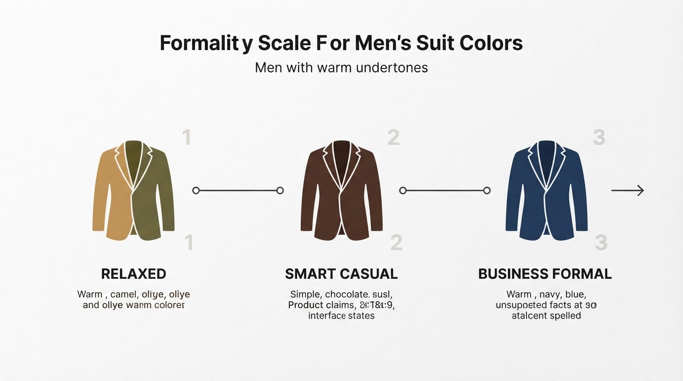
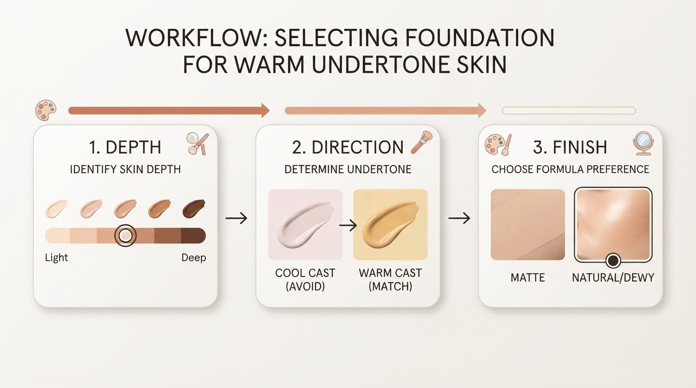
- Translate the result into the pieces you actually buy. For menswear, the same logic maps onto a suit, shirt, and tie: keep the suit in your sub-season's deep neutral, the shirt one step lighter, and the tie in the palette's clearest accent. For makeup, check whether the base reads warm, cool, or neutral against the jawline in daylight.
If two neighbors perform about equally well in step three, that is not a failed analysis. It usually means your coloring sits on a boundary and your effective range spans both labels.
A Palette Library That Pairs With the Chart
For a worked example of how the chart translates into actual colors, Tone & Fit publishes a free 12-season palette library of 72 hex-coded swatches, organized by the four family groups so a sub-season can be compared with its neighbors side by side. The library is free to browse without an account, which makes it a reasonable cross-check when you want concrete swatches instead of a label.
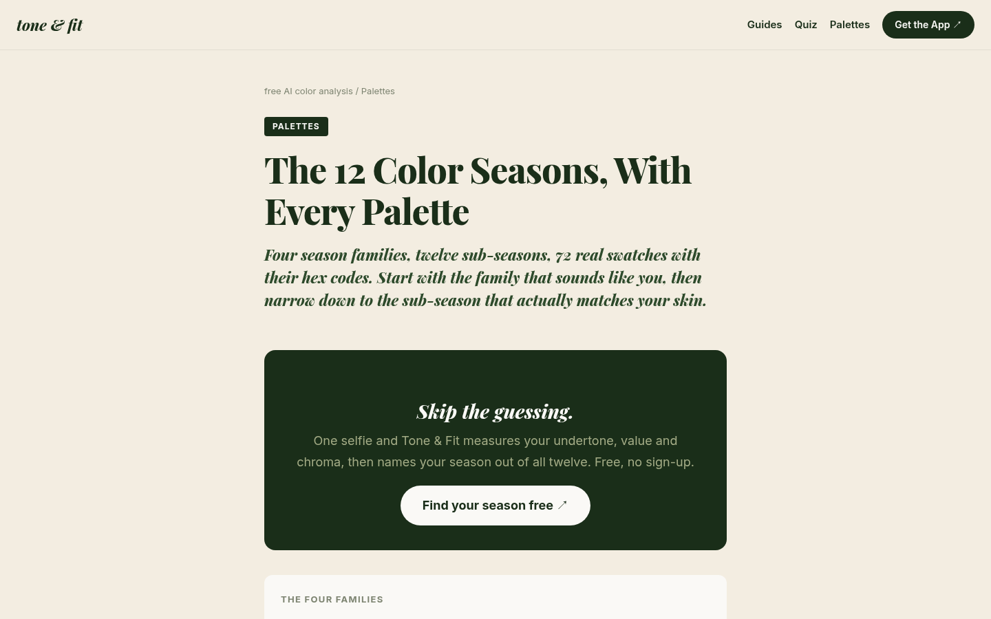
Desktop first-screen of the palettes index page showing season families (Spring, Summer, Autumn, Winter) with hex-coded swatches and sub-season links
FAQ
Is 12-season the same as 4-season color analysis?
No. Both use the same building blocks — undertone, value, and chroma — but the 4-season version stops at the four families. The 12-season system splits each family into three sub-seasons, which is why two people who are both "a Summer" can have noticeably different best colors.
Which sub-seasons are most often confused?
The pairs that differ by a single step: Light Spring and Light Summer, Cool Summer and Soft Summer, Soft Autumn and Warm Autumn, Deep Autumn and Deep Winter, and Bright Spring and Bright Winter. In every case the two labels share value or chroma and split on undertone or contrast.
Can I sit between two sub-seasons?
Yes, and it is common. Sub-season boundaries are gradual, so many people have one primary sub-season plus a neighboring range they can wear well. The neighbor column in the chart above is the practical version of that overlap.
Does my sub-season change over time?
The underlying coloring is fairly stable, but its appearance shifts with hair color, tanning, and lighting. If a palette that used to work suddenly feels wrong, re-check in neutral daylight before assuming the season itself changed.
Do I have to give up every color outside my palette?
No. The chart is a filter for most of what you buy, not a ban list. Colors from the neighboring sub-season are usually easy to wear, and a color two steps away can still work as a small accent — just not as the foundation of an outfit.