What a capsule wardrobe palette actually is
Most capsule advice starts with a number. How many shirts, how many shoes, how many layers. That order is backwards, because the count is the last thing you should decide. A capsule wardrobe palette starts from a closed set of colors you already know suits you, then lets a small group of garments combine inside that set.
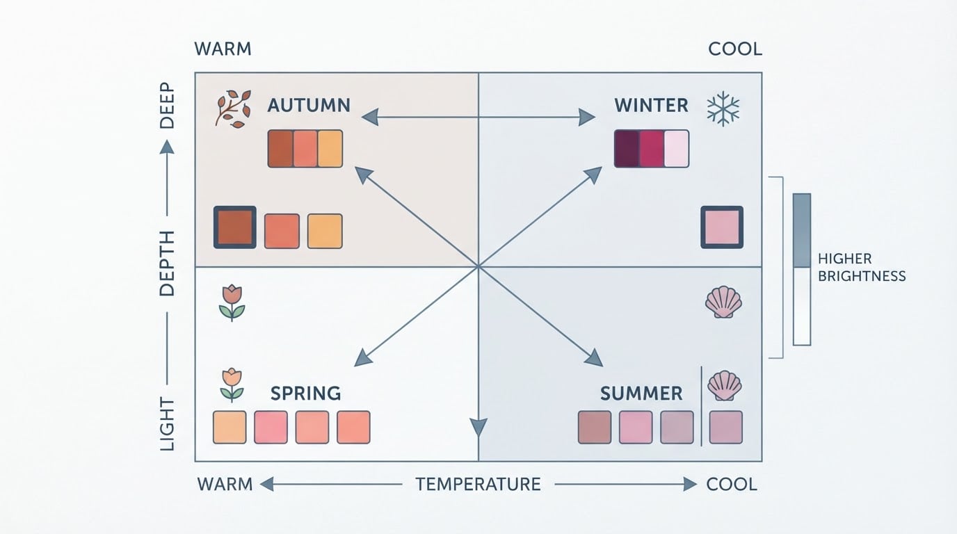
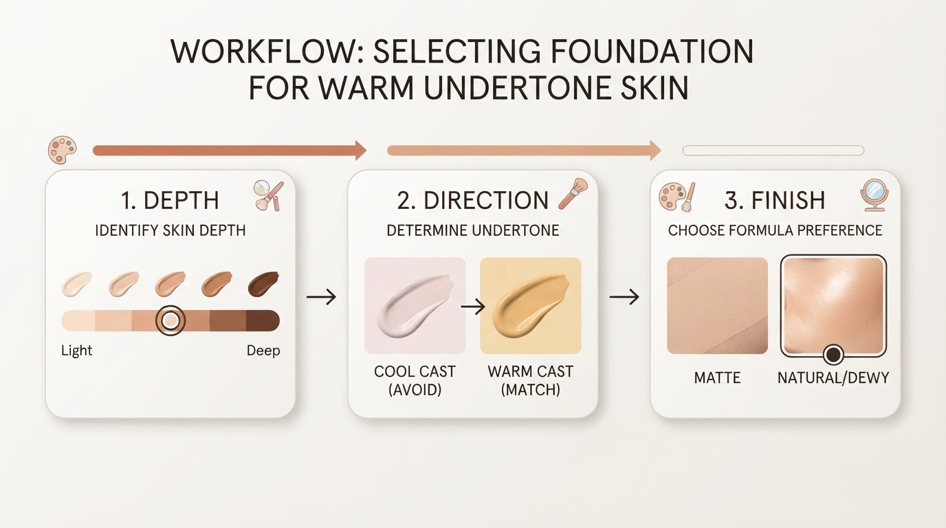
The color set usually comes from a season analysis, which places you in one of the 12 sub-seasons of professional color theory: Spring, Summer, Autumn, or Winter, each split into three sub-seasons. The label matters less than the colors inside it. Color analysis describes those colors with three properties: undertone (warm or cool), value (light or deep), and chroma (muted or bright). Your palette is simply the range where all three work in your favor.
Think of the palette as the rulebook and the capsule as the starting lineup. Garments retire as they wear out, but the palette stays stable, which is what makes repeat shopping decisions fast instead of agonizing.
Step 1: Lock a reference palette before you shop
Build the color set first, then shop. Get a reference palette you can carry with you, either as a physical swatch card or as hex values you can pull up on your phone. Everything below assumes you have that reference in hand before you spend anything.

You can reach it through a professional draping session, or through a photo-based analysis that reads your undertone, value, and chroma from an image. The palette itself is also public. Tone & Fit publishes a free 12-season palette library with 72 hex-coded swatches, organized by the four season families, so you can start from a concrete color set without booking an appointment first.
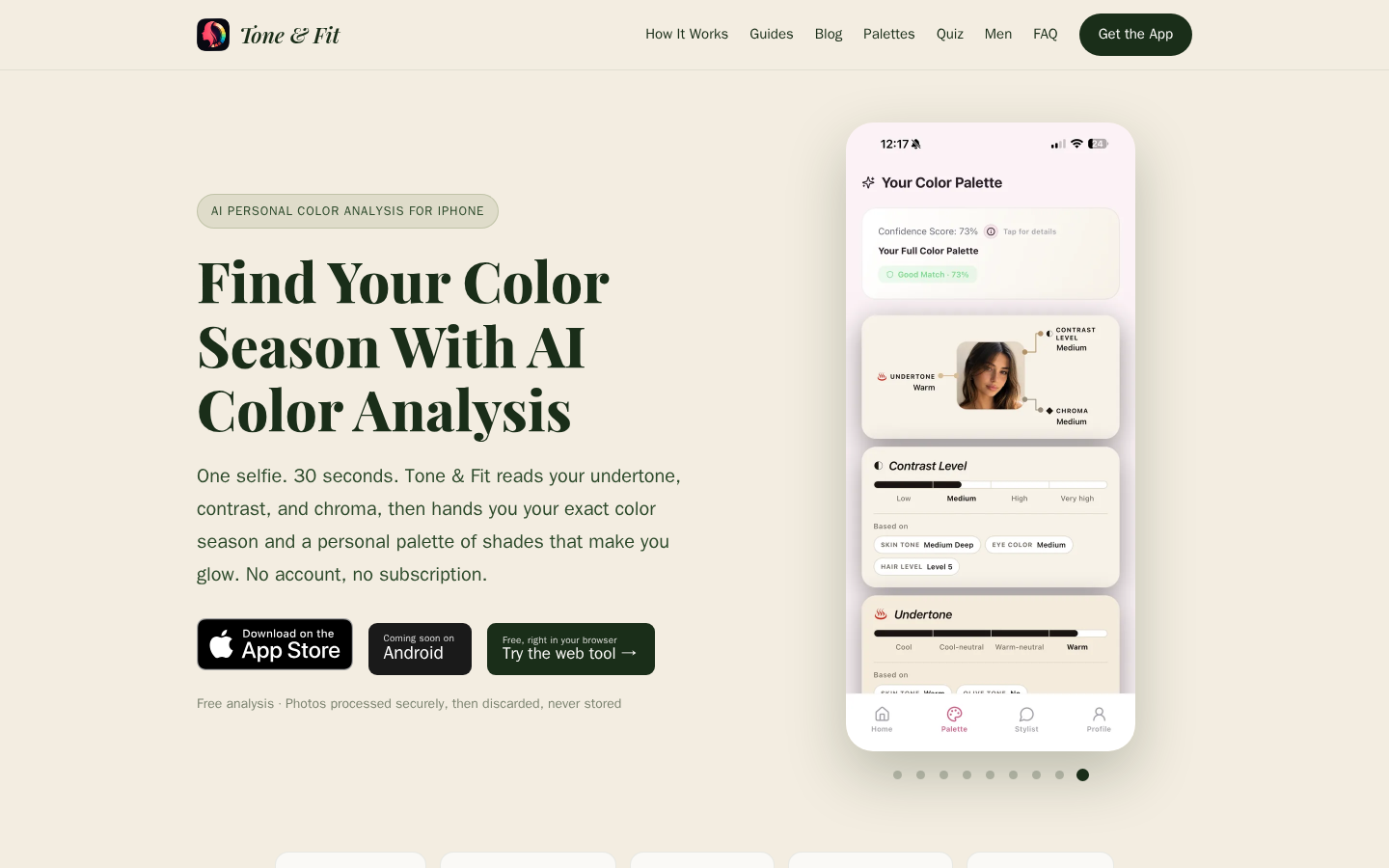
Tone & Fit product interface.
The framework in this article is illustrative. It gives you a repeatable way to organize shopping decisions, not a rule that a palette must contain a specific number of colors.
If two seasons both look plausible
Adjacent sub-seasons share a lot of colors, and plenty of people sit on the border between two of them. Pick one as your primary palette, then borrow only the base colors from the neighboring season. That keeps the reference tight while leaving a little room on neutrals.
Step 2: Sort the palette into bases and accents
A palette is not a uniform list of favorites. Split it into two jobs, and the buying decisions get much easier.
Bases carry the wardrobe
Bases are the palette colors that behave closest to neutrals. You can wear them head to toe without thinking, and they matter most in the pieces you repeat constantly. When a base is right, matching stops being a daily decision.
Accents do the visible work
Accents are the colors people notice first. They are also the fastest way to waste money, because an accent that does not pair with your bases becomes a garment with no partners. Keep accents to a small, repeated set. Repetition is what makes a capsule look deliberate rather than accidental.
| Bases | Accents |
|---|---|---|
Job | Make matching easy | Create the focal point |
How to choose | Palette colors closest to neutral | Palette colors with the strongest saturation or contrast |
Where to spend | The pieces you wear most, in plain fabrics | Pieces worn near the face or as a finish |
Quick test | Pairs with two other bases without clashing | Pairs with your bases and one piece you already own |
Step 3: Decide what to buy first
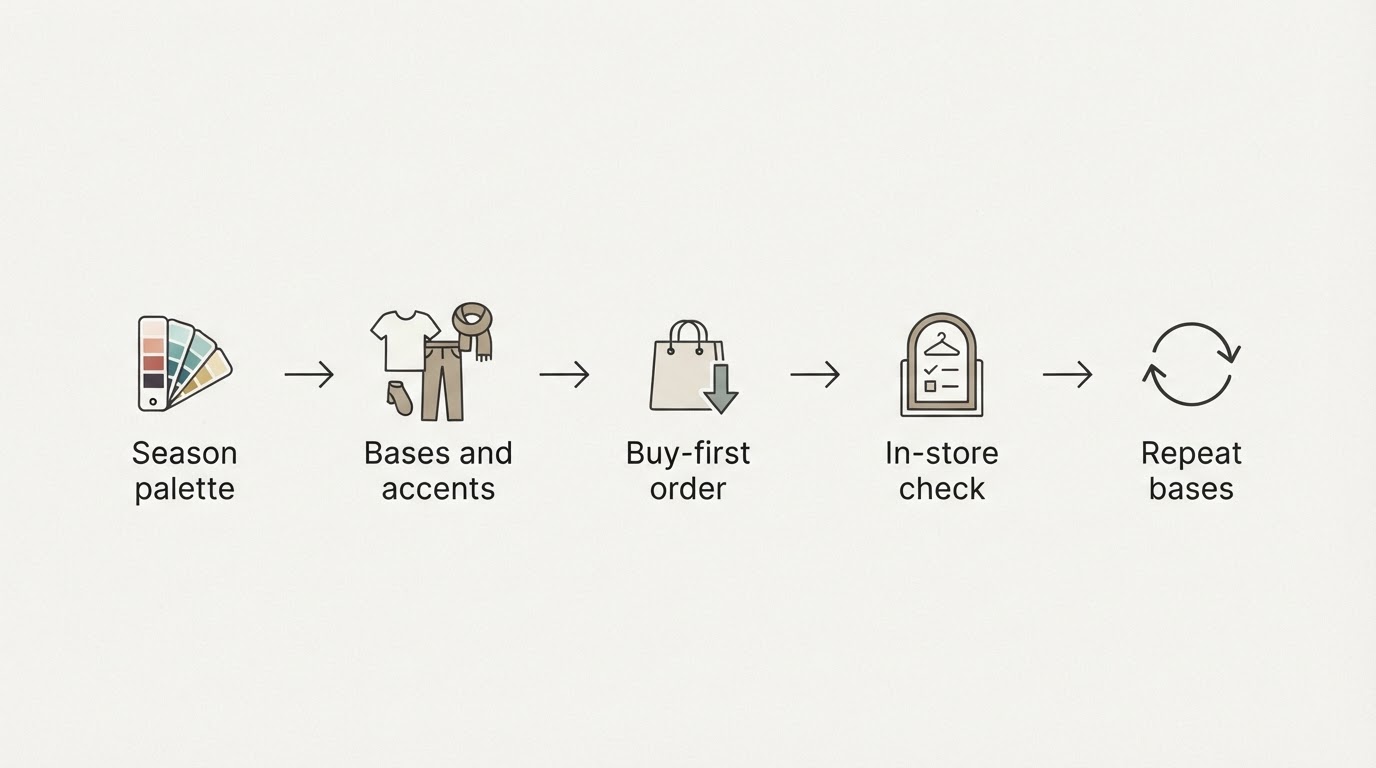
The order of purchase matters more than the list of pieces. This illustrative sequence ranks each purchase by how many combinations it unlocks.
- The layer you wear most. Buy the most-used layer in a base color before anything that only works one way.
- The base that frees clothes you already own. One base in a new category, such as trousers or a knit, can make several neglected pieces usable again.
- One accent that rescues an old favorite. Choose the accent that makes something in your closet wearable again, not the accent that looks best on a hanger.
- The finishing piece you keep reaching for. Buy it last, once the base and accent colors are already doing their job.
You can test a capsule before adding more. Name the purpose, such as work or weekends, then treat that capsule as complete when every base piece pairs with at least two accents on your palette, and each accent pairs with at least two bases. A piece that fails the test is a gap to fill later, not a reason to keep shopping.
Step 4: Filter items in store against the palette
This is where the palette earns its keep. Four checks handle most decisions.
- Compare in daylight. Store lighting is built to flatter, and almost any color passes under it. Walk to a window before you judge.
- Compare the swatch, not the name. "Mustard" or "navy" describes a family, not one color. Two garments sharing a name can sit on opposite sides of your palette.
- Check the fabric, not just the paper. Sheen, texture, and drape change how a color reads on a body. Hold the swatch against the garment, then against your face.
- If it sits between two swatches, wait. A color that only works in one lighting situation becomes the piece you keep skipping.
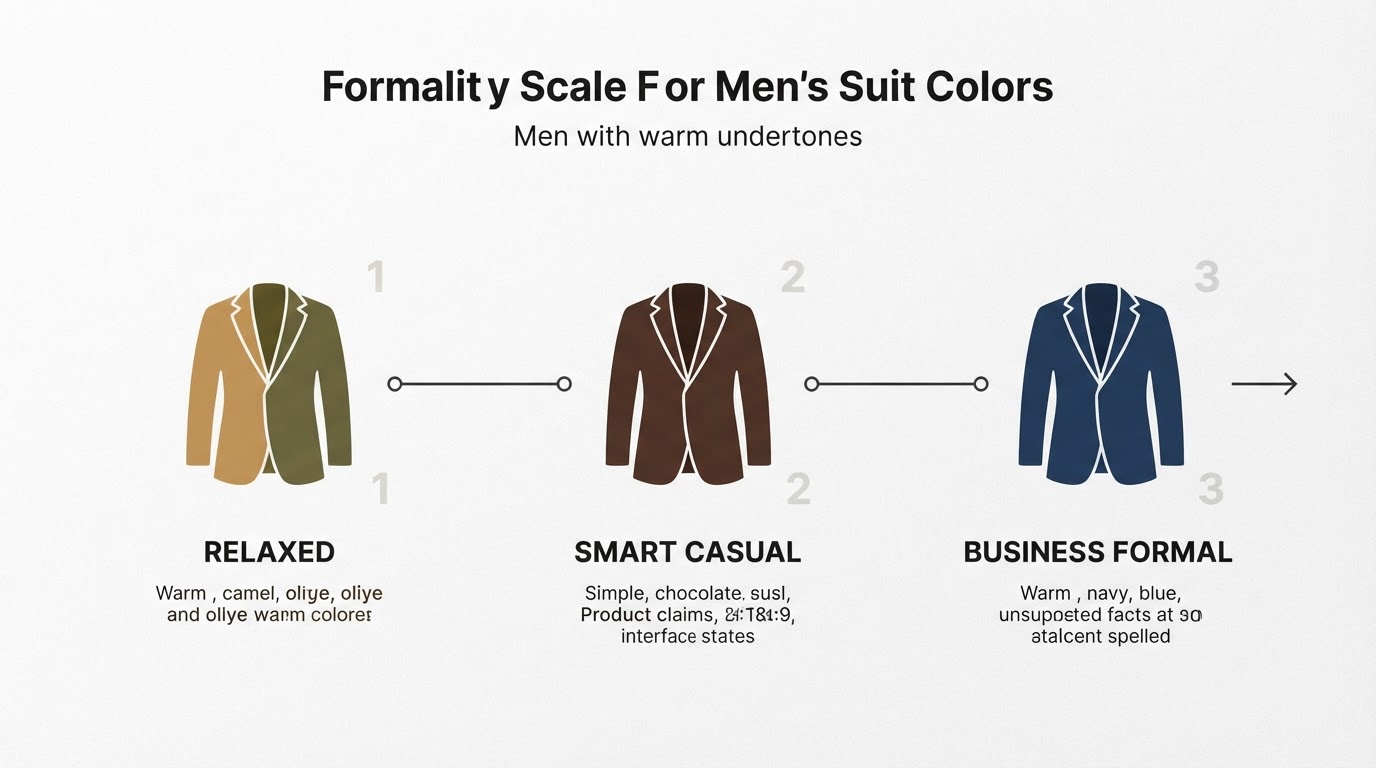
The same checks apply to a suit, a shirt, and a tie, so a fairly formal wardrobe gets the same discipline as a casual one. If the garment and the swatch disagree, trust the swatch and your eyes in daylight, not the store mirror.
Step 5: Keep the capsule cohesive
- Repeat base colors across categories. Denim, trousers, knitwear, and outerwear can share one base family, which multiplies the outfits each piece belongs to.
- Add accents last. Bases make a wardrobe work; accents make it interesting. Buying them in that order prevents orphan pieces.
- Track what you actually wear. The piece you reach for repeatedly is telling you which base deserves a second version.
- Retire the outliers. When a garment stops pairing with anything left in your bases, remove it instead of buying a match for it.
Where a palette-led capsule goes wrong
- A palette is a filter, not a personality. Fit, occasion, and personal taste still decide whether a garment works, and a palette cannot rescue a piece that does not fit.
- Photo-based results move with light. Camera white balance can shift a reading, so re-check a borderline color in daylight before rejecting it outright.
- Dye lots vary. Two garments can carry the same color name and still differ because they were produced in different batches.
- "Avoid" is often positional. A color may be hard to wear near the face without being a color you can never own.
- Capsule counts are shorthand. Piece totals circulate as inspiration, not as requirements, and they rarely survive contact with a real closet.
FAQ
What is a capsule wardrobe palette?
A capsule wardrobe palette is the closed set of colors a capsule is built from, usually drawn from a season analysis. Bases handle the pieces you repeat, accents handle contrast, and every purchase gets a clear job inside that set.
Do I need a professional color analysis to build one?
No. A professional draping session is one route, and a photo-based analysis is another. What matters is having a reference palette with specific colors you can compare against in a store, not the method that produced it.
How many colors should a capsule wardrobe palette have?
There is no universal number, and any figure you read is a starting suggestion rather than a rule. Keep the base range broader than the accent range, because bases do more of the matching work. Treat that split as illustrative and adjust it to your closet.
Can men use a capsule wardrobe palette?
Yes, and the logic is identical. The pieces change, which for menswear usually means suits, shirts, ties, denim, and outerwear. The base and accent split still decides what gets bought first and what gets skipped.