What "washing out" actually looks like
A wash-out color is not automatically an ugly color. It can look beautiful on the hanger and still work against you when it is the piece closest to your face. The mismatch is in the relationship, not the garment.
Four signals show up again and again:
- Shadowing. The hollows under your eyes and the lines around your mouth look deeper than they did in a neutral top.
- Sallowness. Skin turns gray, ashy, or muddy, most visibly along the nose and jaw.
- The color arrives before you do. People notice the shirt first, and your face reads as an afterthought.
- You disappear at the edges. Your jawline softens, your eye color flattens, and you reach for a stronger lipstick to look awake.
There is a quiet fifth signal: the color seems fine for a moment, then looks wrong as soon as you glance away and back. That flicker is your eye adjusting to the color instead of your face. Trust the second look.
Signal | What you see | What it usually points to |
|---|---|---|
Shadowing | New dark circles and mouth lines | Depth contrast is too strong |
Sallowness | Gray or yellow-gray cast | Undertone is fighting the color |
The color wears you | The garment is the first thing noticed | The color's chroma is louder than you are |
Edges go soft | Jawline and eyes recede | The color sits too light or too dusty |
Why one color flatters and another flattens
Every color you hold up has three properties that decide how it behaves next to a face:
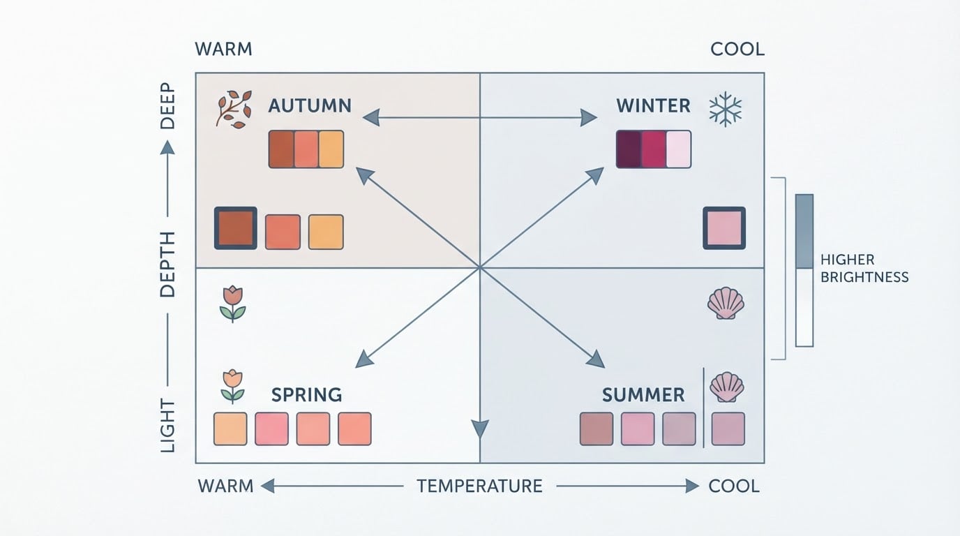
- Undertone — warm (golden, peachy) or cool (pink, blue).
- Value — how light or deep the color is.
- Chroma — how muted or bright it is.
Your face has the same three properties, and they do not have to match the garment exactly. A color washes you out when it pulls hard in the opposite direction on value or undertone. An icy pale pastel on deep, warm coloring is a classic example. A hot, saturated fuchsia on a face with soft, muted contrast is another: nothing clashes, but the color steals the light.
Chroma mismatches are the subtle ones. A dusty rose and a vivid pink can sit two steps apart in the same family, and only one of them will make you look rested. That is why "looks similar in the shop" is not the same as "works on me."
A quick calibration exercise: put a suspect color and a color you trust side by side under the same window, then look at both in a mirror. When the trusted color wins, you have your answer, and you did not need a label for it.
The five-minute natural-light test
You do not need a consultant's set of fabric drapes to run this. You need window light, a neutral top, and a phone.
Set up:
- Stand about an arm's length from a window with daylight coming in. Turn off overhead lights and move away from warm lamps.
- Remove makeup, or at least skip colored foundation, and pull your hair back off your face.
- Wear a plain white, gray, or cream top as your neutral base.
Run the test:
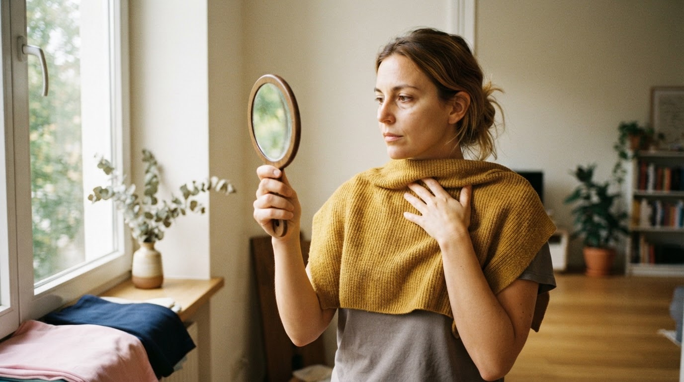
- Hold one color up under your chin, like a bib, covering your shoulders and chest. Fabric works better than a photo on a screen because screens shift color.
- Check the four signals: skin evenness, new shadows, eye brightness, and jawline definition.
- Photograph the color the same way each time. Keep the same distance, framing, and light for every shot.
- Repeat with three or four candidate colors. Add two controls: a color you already know flatters you and one you suspect does not.
- Put the photos side by side on the same screen and rank them.
Completion standard: you can point to two or three colors that reliably make your face look awake, and two or three that reliably make it look tired, without needing to think about it. That is the real goal. Once you can predict how a new color will behave, the test has done its job.
A color "passes" when your skin looks even, your eyes look bright, no new shadow appears, and people see you before the fabric. It "fails" when a gray cast moves in or your face sinks behind the color. Anything that only looks right after a heavy dose of concealer is a fail with extra steps.
Three things routinely skew the test: warm indoor bulbs, a tan or fresh hair color, and phone screens at high brightness. Retest on a different day before you throw a color out of your wardrobe.
Test the clothes you already own
Your closet is a free test lab. Pull out four versions of colors that live close to each other — mustard, lemon yellow, camel, and cream, for example. Line them up on the same rail or lay them on a bed near a window, then drape each one in turn.
Two habits make this faster:
- Compare in pairs, not in isolation. The question is never "is this a nice color" but "is this better than that one for my face."
- Photograph pairs together. Two garments in a single photo under one light source show the difference instantly, and the camera keeps you honest about what you remember.
When you have your short list of colors that flatten you, use it as a filter rather than a rulebook. A tie, scarf, or lip color in a wash-out shade is easy to change; a jacket is not. It often helps to name your two or three worst offenders first — the shades responsible for most of your past regrets — and treat those as a personal filter. A black that is too heavy, a beige that is too gray, or a bright that is too loud are common entries on that list.
Shopping rules that keep wash-out colors out of your cart
Stores are engineered for contrast, not for accuracy. Fluorescent and LED shop lighting pushes colors warm or green, and fitting rooms flatter almost nothing. These rules keep the decision honest:
- Take the garment to the door. Step into daylight near the entrance and hold it under your chin for ten seconds.
- Bring a control. Carry a scarf or a photo of a color you know works and compare the two under the same light.
- Do not decide under store lighting, and do not decide from a screen. Order two candidates if you can and compare them in your own daylight.
- Run the lipstick test. If a color only works when you wear heavier makeup than usual, it is probably fighting you.
- Buy the accent, not the base, when you are unsure. A color that is risky as a jacket can be excellent as a bag, a shoe, or a nail polish.
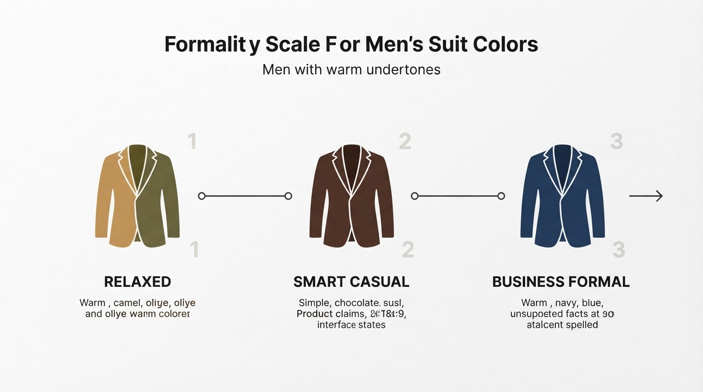
- For menswear, test the collar. Suit, shirt, and tie sit inches from your face; check the shirt and tie fabrics under your chin before you buy, and apply the same depth and undertone logic to denim and outerwear.
The goal is not a ban list. It is a decision shortcut that stops you from buying the same mistake twice.
Where a photo verdict fits in
A photo-based analysis can replace your first sorting pass, especially when you are starting from nothing and do not know which colors to test. Tone & Fit describes its free browser analyzer as running a lighting check and a color-space measurement before returning a season, an undertone reading, flattering jewelry metals, and a few starter colors, with a confidence flag when the lighting looks unreliable — no account needed. The iPhone app behind it reports a 12-season read from a single selfie in about 30 seconds, which is a different starting point from a quiz built on preferences. If you would rather compare swatch families first, the same palette library is available as a free set of 72 hex-coded swatches covering the 12 sub-seasons.
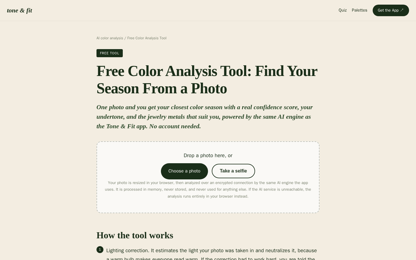
Desktop first-screen of the free web-based color analysis tool with photo upload drop zone, how-it-works steps, and privacy notes
Treat any photo verdict as a hypothesis, not a finish line. Use it to choose the three or four colors you drape in daylight, and use the confidence flag as a signal about the photo — not about your face. A warm table lamp, a heavy foundation, or a shadow across one cheek can push any reading off course, so retake the shot in daylight before you take the result too seriously.
What a photo read cannot do is feel which of two adjacent seasons sits better on you. That is what the drape test is for. The strongest setup is boring: a quick scan for a hypothesis, then five minutes at a window to confirm it.
FAQ
Can a color wash me out even if it looks great on someone else?
Yes, and often. Color is a relationship between the garment and the person wearing it. The same lime green can lift one face and drain another. Comparing yourself to a friend or a model tells you nothing about your undertone, depth, or chroma.
Do I need a professional color analysis to find my wash-out colors?
No. A pro session gives you a thorough, consistent set of drapes and a season label, but a daylight test at home with a few of your own garments will surface the same pattern of shadowing, sallowness, and flattening. Use a professional session when you want a full palette, not when you only need to find the colors that fight you.
Is black always safe?
No. Black is a staple for some seasons and too heavy for others, especially light palettes where a softer charcoal or navy does the same job better. Test black next to your face the same way you test anything else, in daylight.
Why does a color look different in the store?
Store lighting has a strong color cast, and many shops use warm bulbs that push everything yellow or green. Your eye also adapts to the first color it sees. Always confirm a purchase in daylight near the entrance, or order online and compare at home.
How many colors do I need to test?
Three or four candidates plus one trusted control is enough to find the pattern. Testing twenty colors in one session blurs your eye. If you cannot tell two colors apart by the end, stop and retest on another day.
Turn the test into a habit
Write down your keeps and avoids somewhere you will actually see them — a note on your phone works. Keep the photos in one album so future you can compare a new purchase against what already works. Then repeat the drape test whenever your hair color, tan, or the season's daylight changes, because a verdict from January's gray light is not always the right verdict for July.