Cool Undertone Colors to Wear: A Clothing Checklist for Shopping Trips
You already know you have a cool undertone — from a photo-based analysis, a draping session, or the free Tone & Fit colour analysis. The next question is practical: what should you actually reach for when you are in a store? This cool undertone colors to wear checklist for shopping trips keeps the answer portable. It is clothing only, organized by garment category, and short enough to save on your phone.
Two honest limits before the list. Undertone is one useful color dimension, not a complete seasonal diagnosis: depth, brightness, and softness also shape what you enjoy wearing. And no example here is a promise — treat the checklist as a starting point to test against your own skin depth, contrast, and taste. If you searched for the best clothing colors for cool undertones, this guide answers with testable examples rather than rules to obey.
What a cool-undertone result can — and can't — tell you
A cool undertone means your skin leans toward pink, red, or blue undertones rather than golden, peach, or yellow ones. That is a helpful shopping signal: colors with a blue base tend to sit more easily next to cool skin than colors with a strong yellow or orange base. It also explains why the same red can look different on two people — a blue-based crimson reads cooler than a tomato red.
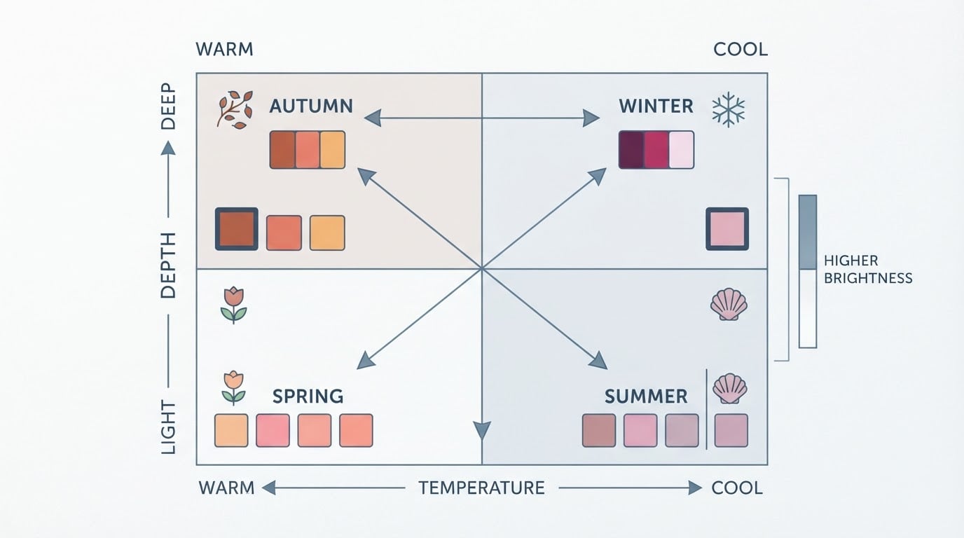
But the result has limits. Two people with cool undertones can prefer very different clothes: one may love deep jewel tones while another reaches for softened pastels. Undertone alone never tells you your depth, your contrast, or your personal style, and it should not be treated as a complete seasonal verdict. Keep those other dimensions in mind, and keep the colors you already enjoy — the checklist is a filter, not a law.
Start with cool-leaning neutrals
Neutrals carry most of a wardrobe, and cool-leaning versions make everything else look deliberate. Build your base from these:
- Navy — the cool counterpart to warm brown or tan
- Cool gray — light heather through charcoal
- Charcoal and near-black
- Crisp or softened whites with a cool cast — look for white that reads slightly blue or gray rather than cream or ivory
These cool-toned wardrobe neutrals become your framework: a navy blazer, charcoal trousers, and a soft white top let a single accent color carry the whole outfit. If you currently default to beige, camel, or olive, try navy and cool gray first — they are the most direct replacements.
A working shortlist of cool skin tone colors to wear
Beyond neutrals, the color families below have the most cool-leaning options. Each example is a direction, not a prescription — the shade you pick should also match your depth and softness.
- Blue — the most reliable family: cobalt, royal blue, steel blue, periwinkle, and blue-leaning teal. Most true-blue denim reads cool.
- Green — emerald, pine, and blue-greens; softened versions such as eucalyptus keep a cool cast when they lean blue rather than yellow. Olive and yellow-green sit on the warm side.
- Purple — violet, plum, and lavender; blue-leaning purples rather than brownish ones.
- Pink — berry, rose, and magenta; pinks with a blue or fuchsia base rather than peach or salmon.
- Red — blue-based reds such as ruby, crimson, and raspberry rather than tomato, brick, or rust.
Jewel tones — sapphire, emerald, amethyst, ruby — are a simple way to apply this shortlist when you want color with presence. Softer versions of the same families (dusty blue, muted plum, heathery gray-pink) do the same job when you prefer less intensity.
Adjust for your depth, brightness, and softness
The shortlist is a starting set, and three personal dials change how each family shows up on you:
- Depth. If your coloring is deep, richer versions — navy over periwinkle, a deeper crimson over bright cherry — usually feel more natural. If your coloring is light, softened or lighter versions of the same families may sit better.
- Brightness. High-contrast coloring can carry saturated cobalt or magenta. If you prefer muted looks, grayed-down versions of the same hues keep the cool cast with less volume.
- Softness. If strong color feels loud on you, keep the cool base and lower the intensity: a muted blue-green instead of a full emerald, a dusty lavender instead of a bright violet.
You do not need to know your exact sub-season to use this. Test one shade from each dial and notice which depth and intensity you re-buy — that pattern is more useful than any label.
Cool undertone clothing colors, by garment category
Here is how cool undertone clothing colors translate into actual pieces. Use the table as your trip reference:
Garment category | Colors to look for | Warm shades to compare against |
|---|---|---|
Tops | Cobalt, berry, soft white, cool gray, heather blue | Cream, beige, salmon |
Layers (jackets, cardigans, blazers) | Navy, charcoal, cool gray, emerald, plum | Camel, olive, rust |
Bottoms (trousers, skirts, jeans) | Navy, charcoal, cool gray, true-blue denim | Warm khaki, brown, olive |
Dresses | Jewel tones, berry, cool red, navy | Terracotta, mustard, warm red |
Occasion wear | Midnight navy, burgundy, violet, cool silver | Champagne, copper, warm gold |
Accessories (scarves, bags, shoes) | Navy, cool gray, berry, cool-toned metallics | Tan, cognac, warm bronze |
Notice the pattern: nearly every row is a cool counterpart of a warm staple. You rarely need a completely new wardrobe — you need replacements for the warmest items in each category.
Compare neighboring shades in consistent lighting
Color names are the least reliable part of shopping. One brand's "navy" can look almost purple next to another brand's navy, and "white" can be cream in disguise. When you are in a store:
- Hold two adjacent shades side by side — a cool navy next to a warm navy, a cool white next to cream — and look at the difference directly.
- Move near a window or outside rather than deciding under warm spotlights or harsh fluorescent tubes, which shift how every color reads.
- If there is a mirror, hold the fabric near your face and notice which side feels harmonious — let your eye judge, not the label.
- For online purchases, look for multiple photos in natural light, zoom into fabric close-ups, and check the return policy before buying anything uncertain.

This compare-don't-guess habit matters more than memorizing any list. It is how you build confidence in your own eye, trip after trip.
What about warm pieces you already own?
A cool-undertone result does not mean every warm piece has to go. Practical options:
- Keep what you love. Colors you genuinely enjoy still have a place. The checklist guides new purchases; it does not sentence old favorites.
- Wear warm colors away from your face. A warm brown belt, cognac shoes, or a tan bag makes less difference than a rust top worn right under your chin.
- Pair warm pieces with cool companions. A cream top under a navy blazer, or warm-tone trousers with a cool gray sweater, keeps both items in rotation.
- Pass along what you never reach for. If a color consistently feels wrong, donating or selling it makes room for versions that feel right.
The goal is a wardrobe that feels easy to shop in — not a purge.
Your compact cool undertone shopping checklist
Here is the cool undertone shopping checklist to save on your phone before a trip. Each item is a quick check, not homework:
- Base layer in navy, charcoal, or cool gray
- At least one cool blue: cobalt, steel blue, or periwinkle
- One jewel tone if you want presence: emerald, violet, or sapphire
- Reds and pinks from the blue-based side: raspberry, berry, magenta
- Whites with a cool cast — skip cream and ivory unless you love them
- Denim in true blue rather than warm khaki or olive
- Compare two adjacent shades in daylight before deciding
- Check online colors in natural-light photos and read the return policy
- Note the color name and brand of anything that works
The quiet superpower of this list is the last item. After two or three trips, your phone notes become a personal reference — color names, brands, and shades that reliably feel right — and every later shopping trip gets faster.
Personalize the shortlist with your analysis result
This checklist stays generic on purpose, because undertone is only one dimension. If your result also names your depth or season, use it to compress the shortlist: a cool summer result points toward softened cool shades, while a cool winter result favors deeper, more saturated versions of the same families. Favor the direction, but let the mirror and your own taste make the final call.
If you do not have a full result yet, or you want a second read before a big shopping trip, the free Tone & Fit colour analysis reads your undertone, value, and chroma from one photo and returns your closest season, with no account needed. The Tone & Fit app then adds your full palette, colors to avoid, and color draping across all 12 seasons on your own photo, so you can see the shortlist applied to you before you shop.
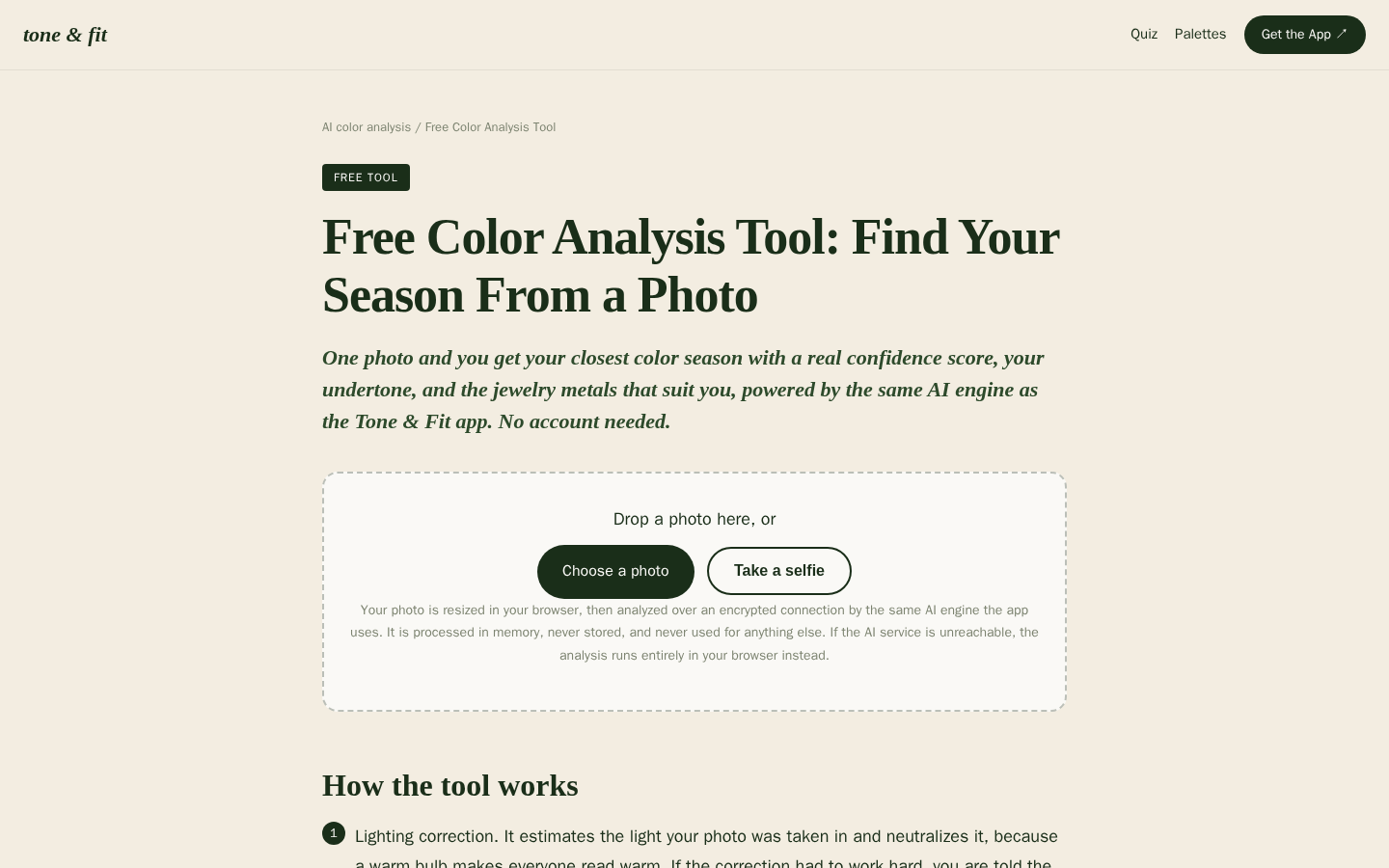
Desktop first-screen of the free web-based color analysis tool with photo upload drop zone, how-it-works steps, and privacy notes
Bring this checklist, compare shades in daylight, and let the colors you actually enjoy have the last word.