Why a New Hair Color Can Change How Your Clothes Read
Hair sits in the frame around your face, so it acts like a large block of color next to your skin. That is why a shade change can make a favorite top feel suddenly loud, or make a piece you had written off look calm and flattering.
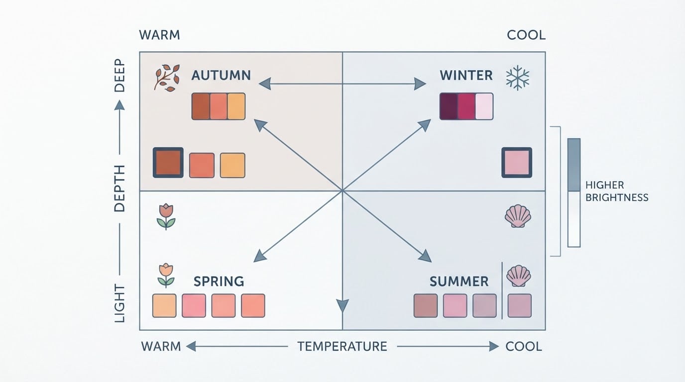
A useful way to think about it: your coloring is a system, not a single feature. Skin undertone, hair depth and warmth, and eye color all interact (How to Dress for Your Coloring). Change one part of the system and the balance shifts.
Two directions matter most:
- Going darker usually raises the contrast between your hair and your skin. Softer, blended tops may read as polished where they once looked flat.
- Going lighter usually lowers that contrast. Colors with a little more clarity or depth near the face can restore definition that the lighter hair reduced.
Neither direction makes your old wardrobe wrong. It changes which pieces do the work they used to do.
Separate Hair Temperature, Depth, and Intensity From Skin Undertone
Mixing these terms together is where most post-change confusion starts.
- Undertone is the base beneath your skin surface: warm (golden, peach, olive), cool (pink, rosy, blue-red), or neutral.
- Temperature describes whether a color leans warm or cool. Hair has a temperature too. Copper and gold-toned browns lean warm; ash blonde, cool brown, and blue-black lean cool.
- Depth is how light or dark a color is. A dye change usually alters this dimension most obviously.
- Intensity, sometimes called chroma, is how muted or vivid a color is. A vivid fashion shade and a soft mushroom brown can sit at the same depth and still read completely differently.
Your skin undertone does not change when you dye your hair, but the colors sitting next to your face do. A wardrobe that harmonizes with cool skin can look tense next to a warm copper, simply because two temperatures now compete near your eyes.
This is also why a color-season result is not invalidated by a hair change. A season maps a relationship among features. If the relationship shifts, the same palette can still work. You are just choosing different shades from it. Compare before you declare your old palette obsolete.
Start With the Clothes Nearest Your Face
Proximity matters more than most people expect. Tops, jackets, collars, scarves, necklaces, earrings, and glasses sit in the reading zone around your face. Pants, skirts, shoes, and bags sit outside it and have far less influence.
So do not audit the whole closet at once. Gather the near-face pieces you actually wear: the five tops, two jackets, and scarves that show up in your week.
For each one, stand in daylight and hold the garment under your chin. Look at your face, not the fabric. Does your skin look even, or does it look shadowed, flushed, or gray? Do your eyes stand out, or does the color pull attention to the fabric? Your face gives you the answer faster than any rule.
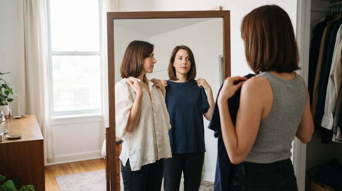
Set aside the pieces you already know work, the ones that earn compliments. They are your reference points for everything else.
Compare a Lower-Contrast and a Higher-Contrast Version
Contrast is the light-to-dark relationship between what you wear and your features (Contrast in Color Analysis). It is separate from temperature. A color can be the right warmth and still fail because its depth fights yours.
Try the same outfit twice:
- Lower contrast: a top close in depth to your hair and skin. Tonal, blended, quiet.
- Higher contrast: a top clearly lighter or darker than both. Crisp, defined, graphic.
Strong natural contrast, for example dark hair against light skin, usually carries a crisp light-dark pairing well: navy with white, black with pale denim, deep jewel tones. Lower natural contrast often looks more polished in a narrow depth range: dusty rose, muted sage, soft camel, medium denim blue.
After a hair change, re-check which version feels like you. Darkening your hair may move you toward the lower-contrast side of your wardrobe. Lightening it may move you toward the higher-contrast side.
Test Your Neutrals Before You Replace Them
Neutrals are the pieces people replace first, and often unnecessarily. Beige, taupe, gray, camel, and charcoal are not automatically safe. Each has a temperature and a depth, and some sit very close to skin tones.
Test the specific neutral, not the category. Your old beige may now merge with your face, while a nearby cream might not. Your charcoal may read heavier than it used to, while a softened gray might work better.
When a neutral still works but feels flat, change what is closest to your face rather than the whole outfit. Add a scarf, swap the necklace, or layer a cardigan or jacket in a color with more definition. You may not need a new wardrobe, just a new top layer.
Use Bridge Colors and Accessories to Integrate the Change
A bridge color shares something with your new hair and something with the wardrobe you already own. If you have moved from warm blonde to cool ash brown, a muted dusty blue can sit between the two worlds. If you have gone from black to copper, olive, rust, or deep teal can ease the transition without demanding a full replacement.
Prints are worth a separate look. A print that already mixes your new hair color with a color you wear often does the bridging for you, which is why a patterned scarf is often the fastest fix after a change.
Accessories do the same job at lower cost:
- A scarf in a flattering temperature adds a bright, defined band near the face.
- Jewelry metal matters more now. Warm gold warms the face; silver or white gold cools it.
- Layering lets a draining top stay in rotation under a jacket that does the flattering work.
- Glasses frames and earrings create a boundary between hair and skin, which can make a difficult color easier to wear.
Treat these as ways to buy time and test before you spend on garments.
Approaches for Blonde, Brunette, Red, Black, Grey, Silver, and Vivid Hair
There is no universal chart. The same shade reads differently on different skin depths and intensities. What follows are starting points to test, not rules to follow.
Hair change | What often shifts | First thing to test |
|---|---|---|
Lightened to blonde | Contrast often drops; features blend more | A clearer or slightly deeper top near the face |
Darkened to brunette or black | Contrast often rises | Softer, tonal tops that used to feel flat |
Red, copper, or auburn | Warm temperature becomes more prominent | Warm-leaning near-face colors; cooler pieces may need a buffer |
Grey, silver, or growing out color | Often softer and cooler; contrast can drop | Cool neutrals, soft contrast, or deliberate definition through accessories |
Vivid fashion color | Intensity becomes the loudest signal | Neutral or muted garments; let the hair carry the statement |
A change on deep skin | Depth may matter less than temperature and intensity | Saturated colors near the face; avoid low-contrast muddy mid-tones |
Whichever row fits you, the test is the same. Hold the piece up in daylight, look at your face, and trust what you see rather than what the label promises.
Photograph the Comparison in Consistent Light
Memory is unreliable when you are comparing colors, and lighting changes everything. A simple photo record makes the decision easier:
- Shoot at the same time of day, near the same window, without filters.
- Wear the same top underneath so you compare the garment, not the outfit.
- Keep the phone at the same distance and angle. A neutral wall behind you helps.
- Avoid warm indoor bulbs, which shift every color you photograph.
Photograph three to five near-face options, then look at the faces side by side a day later. The ones that make your skin look even and your eyes clear tend to stand out immediately. Delete the rest.
Sort Each Piece Into Keep, Restyle, Reconsider, or Shopping Gap
The goal of the audit is a decision per piece, not a feeling of failure. Four groups are enough:
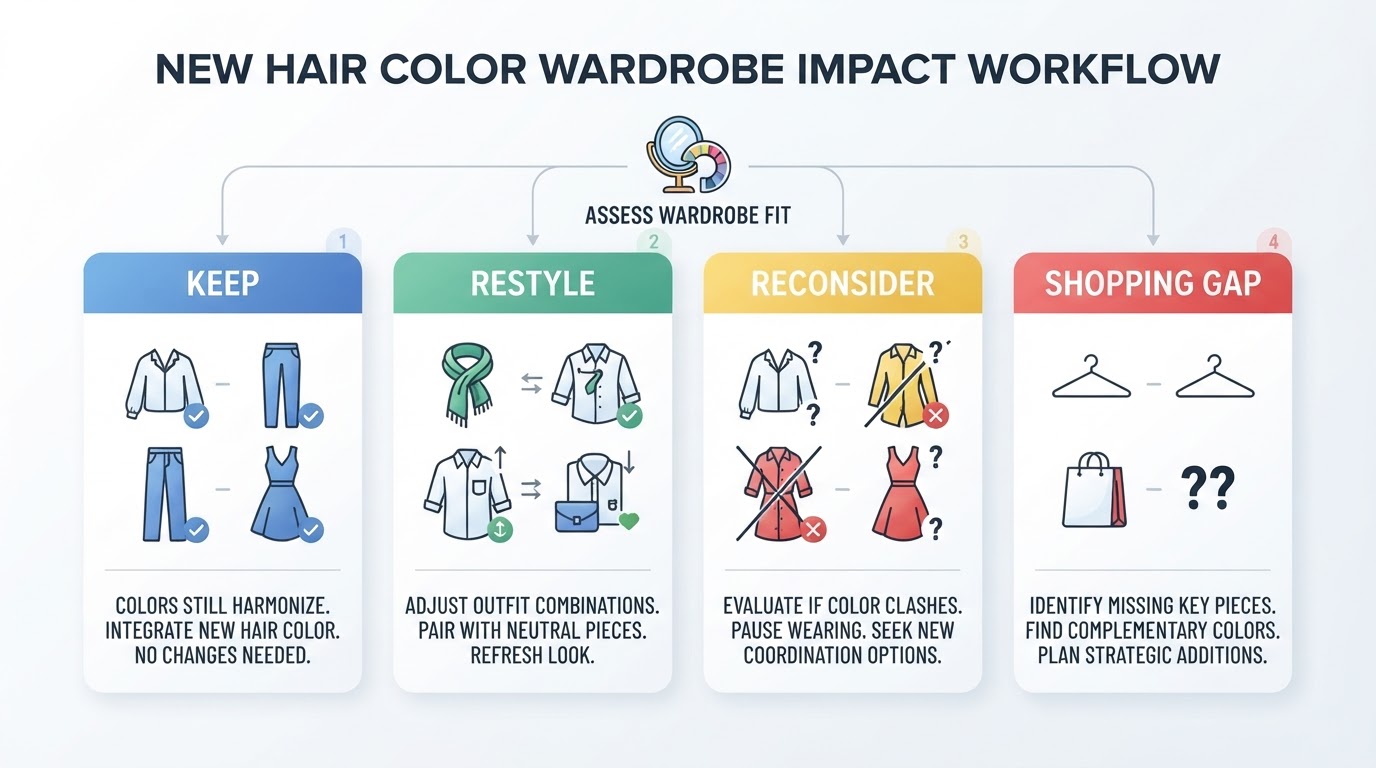
Group | What it means | What to do next |
|---|---|---|
Keep | Works as well as before, or better | Return it to the wardrobe; no action |
Restyle | Works, but needs a bridge layer near the face | Pair it with a scarf, jacket, or accessory you already own |
Reconsider | Only works in specific combinations or lighting | Give it a season; revisit before donating |
Shopping gap | Nothing you own fills the role you keep needing | Add it to a short list, then buy deliberately |
A practical completion standard: run ten near-face pieces through the four groups in one sitting, and do not shop until the list exists. That keeps the audit from turning into an excuse to replace everything.
When to Revisit a Color Analysis, and When an Adjustment Is Enough
A wardrobe adjustment is usually enough when most of your near-face pieces still work, only a few roles are missing, and the confusion is limited to specific items. That is a sorting problem, not an analysis problem.
Consider a fresh analysis when several things change at once, such as hair, tan, skin tone, or a big shift in how you want to dress, or when the same uncertainty keeps repeating across many purchases. A current read on undertone, depth, and contrast gives you a baseline to compare against, rather than a verdict to obey.
If you want a second opinion on your own coloring before you decide, you can run a Tone & Fit color analysis or download the app to keep your result with you while you shop. Tone & Fit also offers a virtual try-on through its AI Hair Studio, with 138 hairstyles and 105 hair colors, so a planned change can be previewed against your analyzed season before a salon appointment.
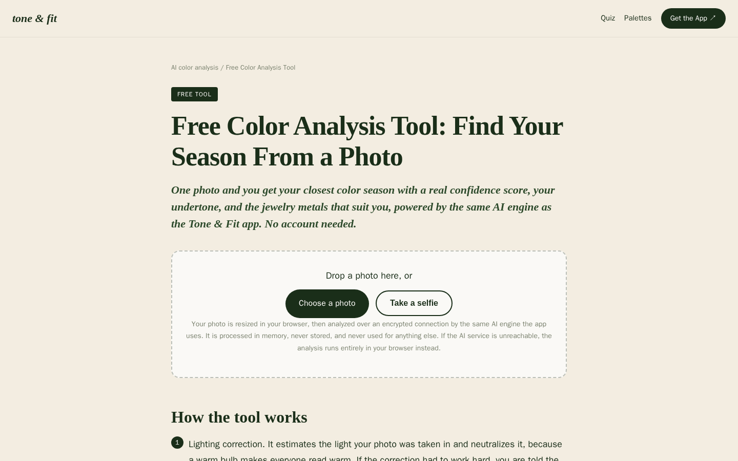
Desktop first-screen of the free web-based color analysis tool with photo upload drop zone, how-it-works steps, and privacy notes
Whichever route you take, keep the last word. The clothes are tools for the life you are living, and your face, not a rule, is the final check.