How to Shop for Clothes Using Your Color Season
You already have your color analysis result and a palette you trust. The hard part was never the draping — it is the next shopping trip, where a "camel" sweater is actually orange, the store lighting lies, and the color name on the tag disagrees with your palette. This guide is a repeatable method for how to shop for clothes based on your color analysis season: a short, gap-driven list, a handful of comparison habits, and a save, try, return, or skip decision you can make in under a minute — online or in stores.
Your season is a description of how much warmth, depth, and clarity your coloring carries, not a list of laws. Everything below treats your palette as a working reference you can bend, not a uniform you must obey.
Start with the result and palette you already have
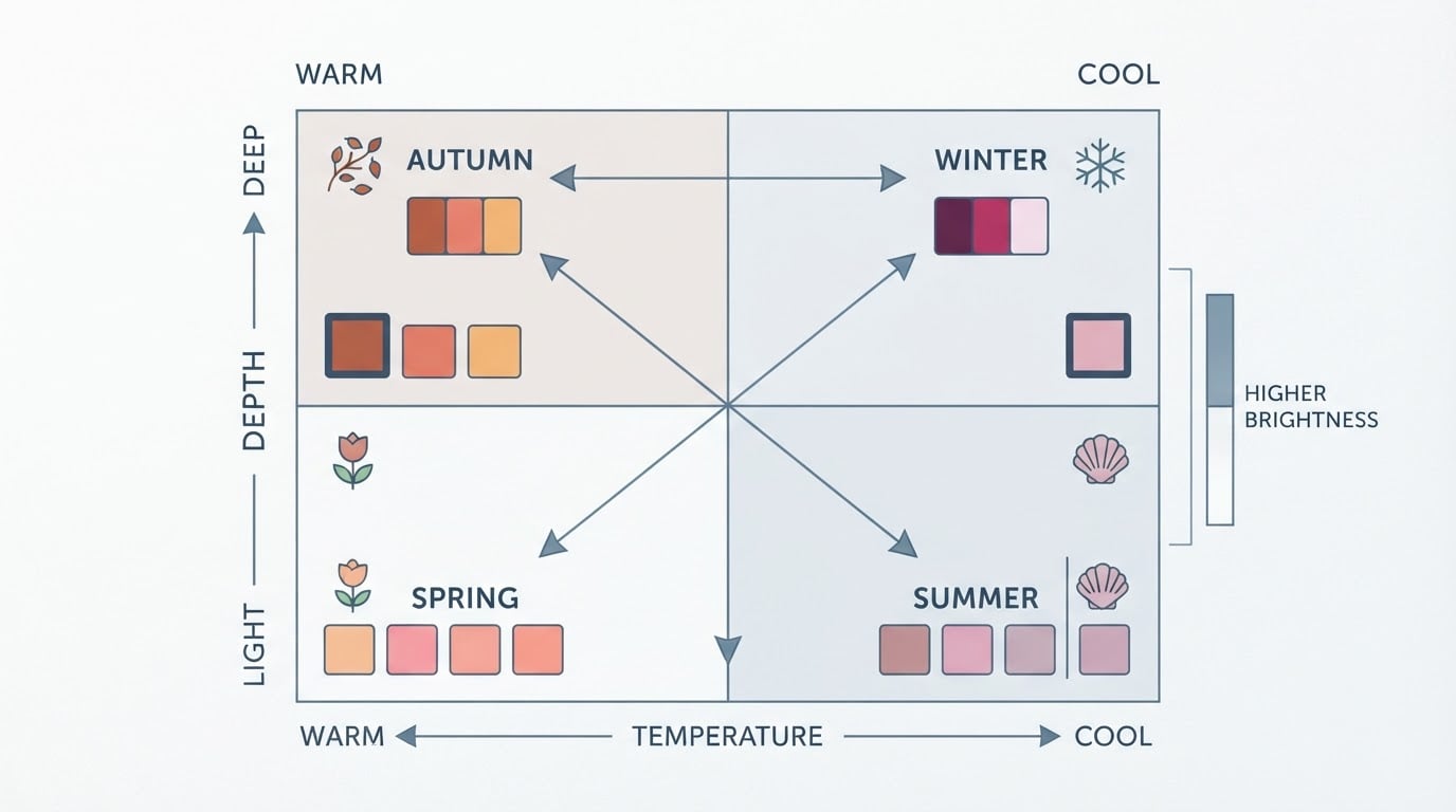
Before any trip, pull up your result and write down four things: the season family and sub-season if your system uses one (for example True Autumn or Cool Summer), your palette's overall temperature, its depth range, and its intensity level. Then save your palette as a swatch reference you can actually see while shopping — a screenshot on your phone works for both online and in-store trips.
If you have not yet turned your result into a wardrobe plan, the wardrobe-palette guide covers that step in detail. Here, the assumption is simpler: you have a palette and a rough idea of the colors in it, and you need to apply that information garment by garment without re-reading a color theory course at the fitting room.
Turn real wardrobe gaps into a short shopping list
A palette without a list produces impulse buys in palette colors you already own. Instead, audit the categories you actually wear — not the ones you wish you wore. Look at the past two weeks and note the gaps: the blazer that is wearing out, the jeans that no longer fit, the neutral top you reach for every week and own only once.
Write down three to five items max. A Light Summer office worker might list one work blouse, one cardigan, and a pair of gray trousers. A Deep Winter man rebuilding weekend basics might list two tees and one overshirt. A Bright Spring shopper on a tight budget might list one dress that works for both a wedding and a night out. Every item on the list should answer a question you already have, not a question the store invents for you.
Sort candidates into versatile neutrals, core colors, and optional accents
Once you have a list, remember that not every color in your palette does the same job. Three roles keep a wardrobe wearable:
- Versatile neutrals — the quiet anchors (navy, charcoal, cream, warm gray, olive depending on your season) that pair with almost everything you own.
- Core colors — the palette colors that carry your favorite outfits and appear in several categories, like a burgundy that works as a sweater, a blouse, and a scarf.
- Optional accents — the expressive colors you love but only need in small doses, such as a statement top or a printed accessory.
When money is tight, spend on neutrals and core colors first — they get the most wears per dollar. Accents are where a budget brand or a secondhand find is a low-risk win, because an accent that misses still costs little to rotate out.
Shopping online: compare photos, color names, and multiple garment images
Retailer color names are marketing, not measurement. "Navy" on one site is near-black; on another it is a bright cobalt. So never decide from the name alone, and never from a single product photo. Open the gallery view and compare three things: the model photos in different lighting, the flat-lay or detail shots, and any customer photos showing the garment in natural light.
Look for the same garment photographed on different skin depths if the listing has them — that tells you how the dye actually reads rather than how the studio lighting flattered it. If the color still feels ambiguous, search the color name plus "in natural light" or check the fabric content: a matte cotton knit and a shiny viscose in the same dye lot can look like two different colors entirely.
Use a palette reference and side-by-side comparisons in stores
In a physical store, your phone's palette screenshot is your single most useful tool. Pull the garment off the rack, then hold it next to your screen's swatches — not under the store's ceiling lights, which skew warm or harshly cool, but near a window or in daylight if you can reach one.
Never evaluate one garment alone. Bring the two closest candidates together and hold them side by side, one in each hand, alternating which is closer to your face. The difference between a muted olive that sits inside your palette and a bright army green outside it is often invisible until the two are touching. Ask for a second size or a neighboring shade if the store has one — the goal is comparison, not commitment.

Evaluate temperature, depth, and intensity instead of relying only on retailer color names
Retailer names collapse three separate dimensions into one word, which is why two "burgundy" sweaters can both be called burgundy and still be completely different garments for you:
- Temperature — is the color warm (golden, peachy, brown-based) or cool (blue-based, ash, violet-tinted)? A blue-based red and a tomato red are different temperatures wearing the same name.
- Depth — how light or dark is the shade? A deep palette needs darker versions of a color; a light palette needs softer, lighter versions.
- Intensity — how clear and saturated versus muted and grayed is the color? Muted seasons (Soft Autumn, Soft Summer) usually sit best with softened versions; bright seasons (Bright Spring, Bright Winter) can carry more saturation.
When you look at any garment, ask one question per dimension. A "mustard" shirt that reads brownish-olive and low in saturation is a different purchase from a clear, bright mustard — even if the tag says the same thing.
Decide what to do when a garment falls outside the suggested palette
An off-palette color is not an emergency, and your season is not a dress code. When you love a garment that sits outside your palette, run it through these options before walking away:
- Move it away from your face. A cognac belt, a tan bag, or rust-colored shoes touch your coloring far less than a rust top worn under your chin.
- Pair it with a palette anchor. A warm-adjacent blouse under a navy blazer, or bright trousers with a muted core-color sweater, lets the piece participate without leading.
- Keep the exception small and deliberate. One beloved off-palette item you reach for constantly earns its place; five of them quietly rebuild the problem you solved with your analysis.
- Say no when the color fights your palette's temperature. A cool-season shopper trying to love a strong yellow-orange will usually keep forcing it; that is the signal to skip, not to buy and rationalize.
Check coordination with clothes, shoes, and accessories you already own
Before any purchase, mentally dress the garment with three existing pieces — one top or bottom, one layer or jacket, and one pair of shoes or bag. If you cannot picture two outfits that include it, it will likely hang unworn regardless of how perfectly it matches your palette.
This check is where the method earns its keep across dress codes. A True Autumn lawyer testing a brick-red blouse against the charcoal suit and tan loafers already in rotation knows it works for the office; the same blouse fails the check for a Soft Summer nurse who lives in muted blue scrubs and white sneakers. The palette says the color belongs to your season; the coordination check says whether it belongs to your life.
Create a simple save, try, return, or skip decision checklist
End every trip with a decision, not a maybe. Run each candidate through this checklist and act on the result:
- Matches your palette on temperature, depth, and intensity — not just the color name
- Coordinates with at least two outfits from clothes, shoes, or accessories you already own
- Fills an item on your gap list, not just a color you like
- Verified against a palette reference in natural light, online or in store
- Returnable or exchangeable if it reads differently at home (online especially)
- A deliberate exception if it is off-palette — with a plan for where it will be worn
Save when the garment passes every box but you are not ready to commit. Try when it passes and the store offers fitting rooms or free returns. Return without guilt when a home check in your own lighting overrules the store verdict. Skip when any box fails — skipping is a completed decision, not a failed trip.
No color season result yet? Run a free Tone & Fit color analysis
If you reached this guide before getting your own result, the free Tone & Fit color analysis tool reads your undertone, value, and chroma from one photo and returns your closest 12-season match with starter colors — no account needed. The Tone & Fit app goes further, adding your full palette, colors to avoid, and the ability to drape all 12 palettes over your own photo, so you can preview how a shopping shortlist actually looks on you.
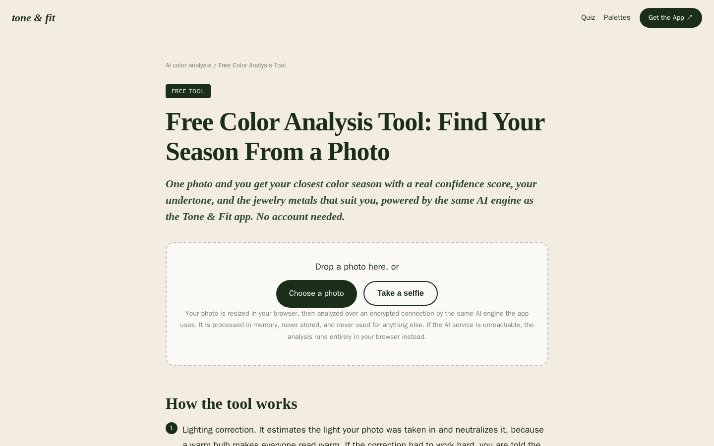
Desktop first-screen of the free web-based color analysis tool with photo upload drop zone, how-it-works steps, and privacy notes
Treat any analysis result as a starting point to test against your own eye and your own wardrobe — not as a guarantee. Run the free analysis, build your short list, and let the save, try, return, or skip checklist do the deciding on your next trip.