What This Wardrobe Test Can and Cannot Establish
A seasonal color quiz result is a hypothesis about your coloring. The useful question is not whether the quiz was perfect. It is whether the result predicts what happens when cloth sits next to your face, and that is something you can check with the wardrobe you already own.
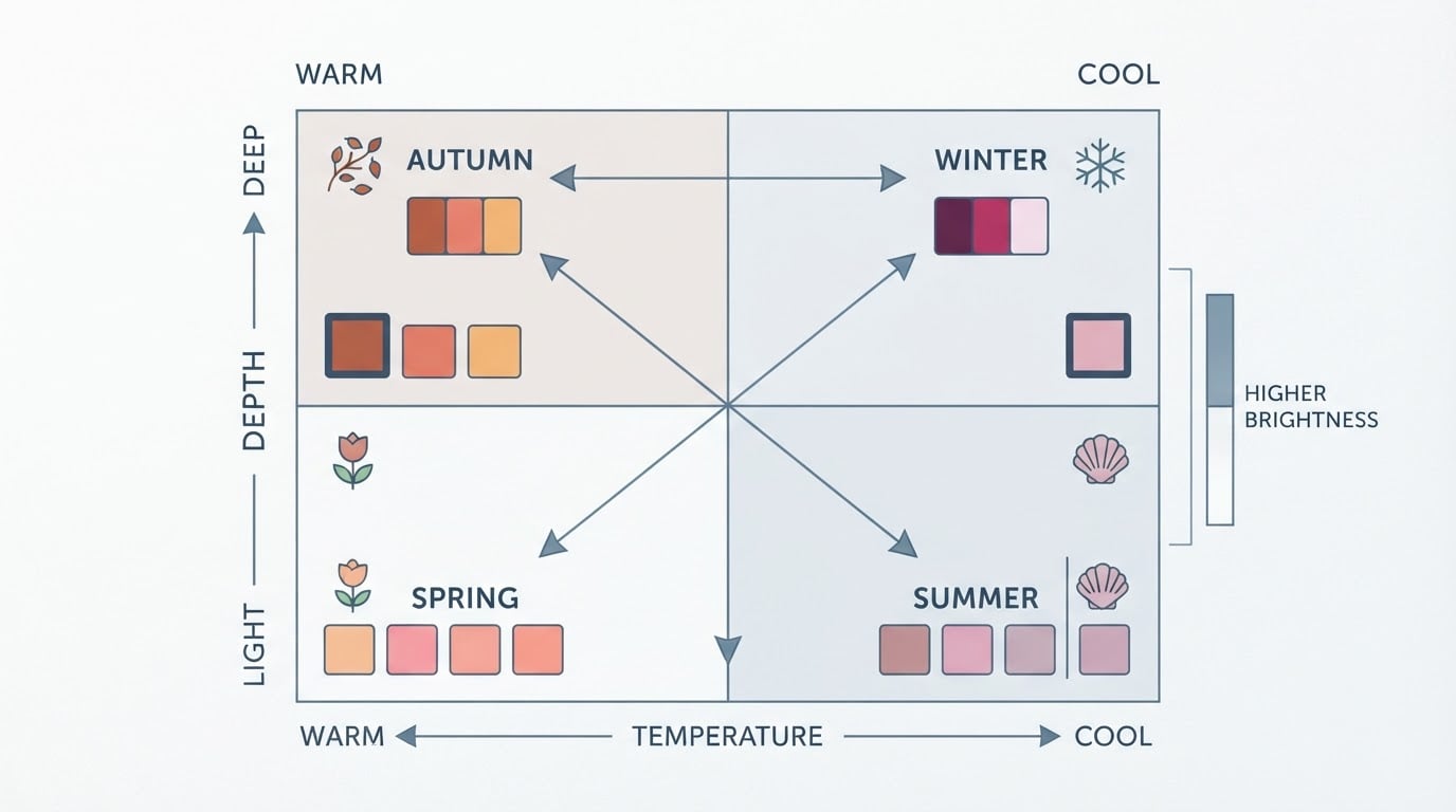
What this exercise can establish is a direction. When you compare matched garments under stable light, you can see whether your skin looks even and rested more often with warm or with cool colors, with light or with deep colors, and with clear or with muted ones. Temperature, value, and chroma are the same three variables professional color analysis uses, and they are the three variables you are checking here. You are not assigning yourself a new label; you are checking which way the label you were given points.
What it cannot establish is a verdict. A home comparison does not prove a season, and it is not a diagnostic method. Lighting, fabric finish, surrounding colors, makeup, hair color, and personal preference all bend perception, and two people can honestly sit on the boundary between neighboring seasons. Work through this as a verification exercise with a completion standard, not as a scoring system, and not as another quiz.
The completion standard is simple: you are done when the same pairs read the same way on two separate days in the same light, and you can state a direction on all three variables.
Pick Garments That Compare One Variable at a Time
The test only works if each pair isolates a single difference. Two garments that differ in color, fabric, and finish at once tell you nothing you can repeat.
Start with items you already own: two cotton T-shirts, two scarves with a similar sheen, two bath towels, two pillowcases, or fabric swatches if you have them. A plain scarf, a T-shirt, or a folded towel all work as a drape, so you do not need a kit. What matters is that the two pieces are close in size, material, and texture, so the color is the only real variable.
Build your pairs so that the two garments differ on one axis only: temperature, value, or chroma. Then assemble three small sets:
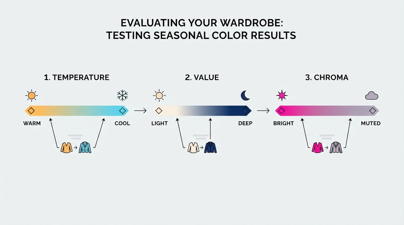
- Temperature (warm versus cool): a tomato red against a blue-red, coral against fuchsia, a warm gold against a lemon yellow, or olive against emerald.
- Value (light versus deep): a pale version of a color against a rich version — powder blue against navy, blush against burgundy, pale gray against charcoal.
- Chroma (bright versus muted): a clear, saturated shade against a grayed-down one — emerald or cobalt against olive or mid gray.
Keep one white cloth and one cream or ivory cloth within reach as a neutral base, and add a gray and a charcoal if you own them. Set aside anything patterned, sheer, or very small, and avoid pairing a matte piece with a shiny one until you have your direction; finish differences can outweigh the color difference you are trying to see.
Set Up Indirect Daylight and a Plain Background
Light is the variable you cannot control after the fact, so control it before you start. A north-facing window, or any window on a bright overcast day, gives the even, neutral light that makes near-face comparisons readable. Direct sun, warm bulbs, and low-quality LEDs all cast their own color onto your skin.
Position yourself so the light falls on your face rather than behind you, and angle a mirror to catch the same light. Drape a white towel or sheet over your shoulders so your clothing disappears, and pull your hair back from your forehead and cheeks; dyed or graying hair frames your face with its own tone, so keep it off the skin you are judging. A bare face is best, but if you wear makeup, keep it identical across sessions and note it. Clear the space behind you as well: a bright wall, printed art, or a colorful bedspread reflects color back at you and adds competing tones.
Then fix the rest of the setup. Use the same spot, the same time of day, and the same light for every session, and photograph each comparison with your phone's filters and auto-enhancements off. A still image is easier to judge calmly than a live reflection, and it lets you compare two days without relying on memory.
Run Near-Face Comparisons One Variable at a Time
Hold the fabric directly under your chin so it fills your lower vision, and keep it there for a few seconds while you look at your whole face rather than at the cloth. Then swap it for its partner, back to back, and watch the same features again. This contrast is where the information lives; a single color held up alone almost always looks acceptable.
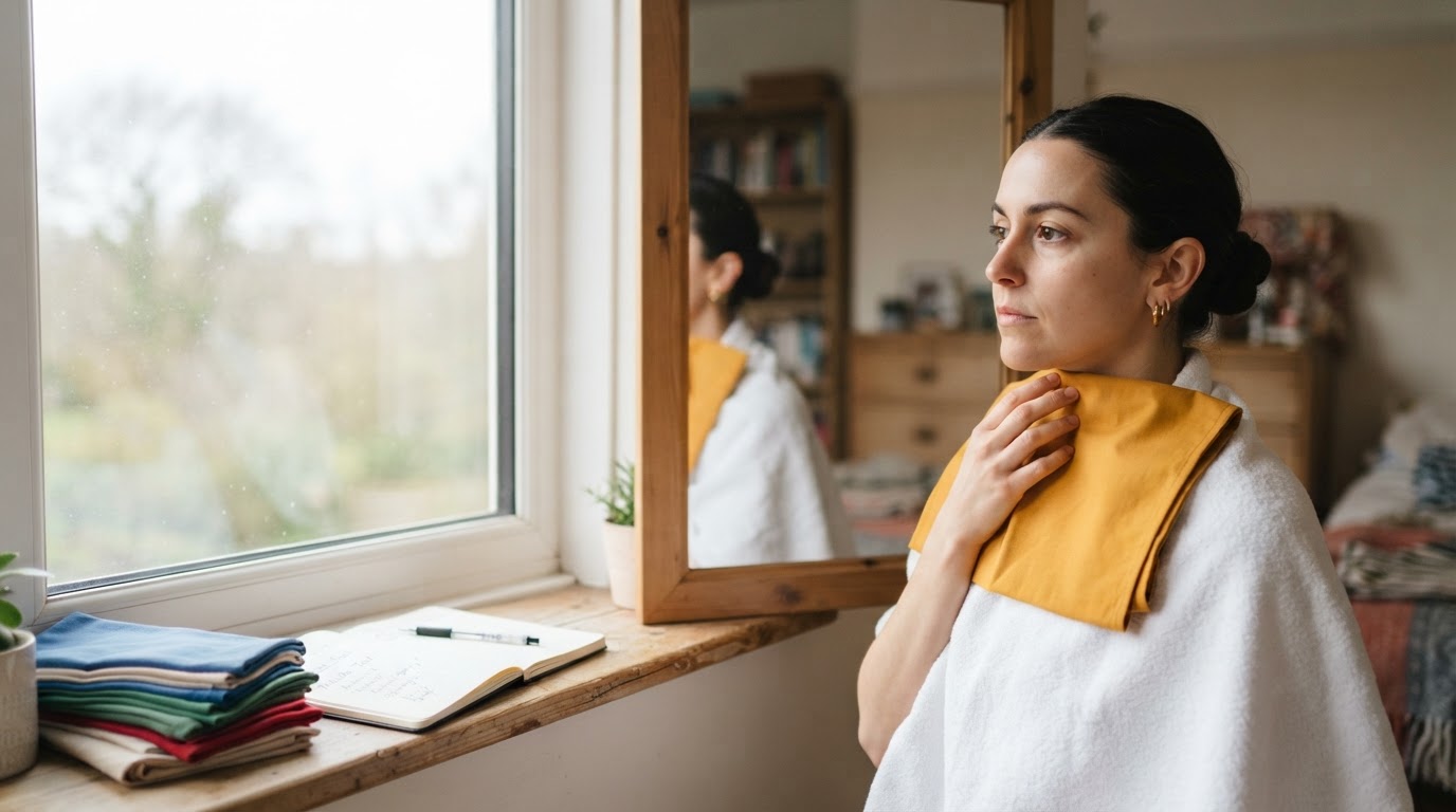
Judge your face, not the garment. When a color works, your skin tends to look even and rested, under-eye shadows soften, redness recedes, and the cloth seems to sit behind your features. When a color fights you, your skin can pick up gray, ashy, or yellow tones, lines and shadows deepen, and your eyes look flatter. A fabric you love on the hanger can still produce the second reading; that is exactly what the test is for.
Run one variable per round. Finish the temperature pairs before you move to value, and finish value before chroma. Mixing stimuli is the fastest way to end up convinced that everything suits you. If someone can hold the fabric for you, the comparison gets cleaner, because you can keep your face still and simply watch.
The process does not change with your coloring, hair, or style. A reader with deep skin and dark hair may find contrast the loudest signal, while someone with fair skin and light hair may read temperature more easily. A man testing dress shirts and ties can fold a shirt under the chin exactly as someone tests a scarf, and the same matched-pair logic works whether you dress in a few minimal layers or keep a fuller, more textured wardrobe. You are comparing the same three variables in every case.
Compare Warm Versus Cool Pairs
Temperature is usually the first divide, so give it the most repetitions. Work through your warm-versus-cool pairs one after another: tomato red against blue-red, coral against fuchsia, warm gold against lemon yellow, olive against emerald.
As you swap, note which side leaves your skin looking clearer and which side introduces a cast. If the warm versions consistently soften shadows and the cool ones add gray, you are reading warm. If the cool versions look crisp and the warm ones turn you sallow, you are reading cool. If gold and silver jewelry are already in the house, a quick metal comparison at the start can preview the same direction, but treat it as a hint to test, not a conclusion.
Do not average the pairs. A single pair that swings clearly is more informative than several pairs you find hard to call, so mark the clear ones and repeat them in the next session.
Compare Light Versus Deep and Bright Versus Muted Pairs
Value asks whether your face blooms in soft, pale color or comes alive in rich, dark color. Hold the pale version of a shade, then its deep partner, and watch whether the light one softens your features or washes them out and whether the deep one frames your face or sits on it like a weight.
Chroma asks whether saturation sharpens you or overwhelms you. A clear emerald or cobalt next to a muted olive or mid-gray is a fair test: bright coloring tends to look more defined beside the saturated version, while softer coloring looks calmer and clearer beside the grayed-down one. Then check your neutrals with the same discipline. White against ivory is a quick temperature read; mid-gray against charcoal shows how you handle both muting and depth.
Black deserves its own note because it is the shade people test last and trust most. It flatters some deep, cool colorings and can flatten others, so let the face in the mirror decide rather than the idea of black as a staple.
Record Repeatable Observations Without Leaning on a Favorite
Write down what you see before you start explaining it. A compact worksheet is enough:
Variable | Pair tested | Which side looked even and lit | Notes (light, date, anything unusual) |
|---|---|---|---|
Temperature | Tomato red vs. blue-red |
|
|
Value | Powder blue vs. navy |
|
|
Chroma | Emerald vs. olive |
|
|
Neutrals | White vs. ivory |
|
|
Fill one row per pair, and keep the notes about the light as carefully as the notes about color. Then repeat the clearest pairs on a second day in the same spot. Only the results that survive the repeat belong in your decision.
This is also where a favorite color can mislead you. A shade you love can be a strong preference without being your most flattering one, so test it against its opposite rather than trusting it by default. If a beloved piece wins its pair on both days, keep it with confidence; if it loses, you have learned something the quiz could not tell you.
Interpret Mixed Results Without Forcing a Verdict
Most people get a clear answer on one or two variables and a muddier one on the rest, and that is a normal result rather than a failed test. A cool reading on temperature with a muted reading on chroma but no clear direction on depth already narrows you toward a particular corner of the seasonal map; check that corner against the palette descriptions you have.
Mixed results can also point to a neighboring season or to a neutral undertone. If gold and silver are a genuine tie, or warm and cool pairs keep splitting, look at whether soft or bright is the clearer signal and let that lead. When two seasons both feel plausible, re-test the specific pairs that separate them rather than repeating the whole exercise.
Some sessions simply will not settle. If your notes flip from day to day, or the light was unusual, keep the worksheet and leave the question open. A second read from an independent method can break the tie, and the next section covers one option. What no home test should do is convert a mixed result into a confident season you did not actually observe.
Turn Your Notes Into a Keep, Compare, and Pause List
The output of this exercise is a short list, not a wardrobe overhaul. Sort what you tested into three groups:
- Keep: pieces that won their pair clearly and repeated the win on the second day. These are the colors your quiz result predicted and your own eyes confirmed.
- Compare: pieces that were close, or that read differently in different sessions. Re-test these before you decide anything about them.
- Pause: pieces that pointed the other way. You do not need to discard them today. Pausing simply stops the wrong direction from growing while you finish checking the result that produced it.
The decision rule is repetition. Act on the pairs that stayed stable across two sessions, and treat one-day results as provisional. That is the practical value of testing before shopping: the pause list gets longer, the replacement list gets shorter, and the next purchase starts from something you observed rather than something you assumed.
This exercise does not build a complete wardrobe system, and it is not meant to. It only judges whether the result you were handed is useful enough to guide what you keep, what you re-check, and what you leave alone.
Use Tone & Fit as One More Reference Point
Your worksheet is first-hand evidence, and it deserves to be the first thing you trust. A second reference point is most useful when your notes are split or the light was marginal, because an independent read can confirm a direction or send you back to test a pair you rushed.
Tone & Fit's free color analysis is built for that role. It reads a photo and returns your closest season with a few starting colors, using the same three variables the exercises above test — temperature, value, and chroma — and the Tone & Fit app carries the fuller picture, including a full palette, colors to avoid, and recommendations for hair, makeup, and jewelry. Treat any second read the way you treated the quiz: as a hypothesis to compare with your own observations, not as a guarantee. When the second read agrees with your notes, you have a stronger case for acting. When it disagrees, re-test the contested pairs before changing anything.
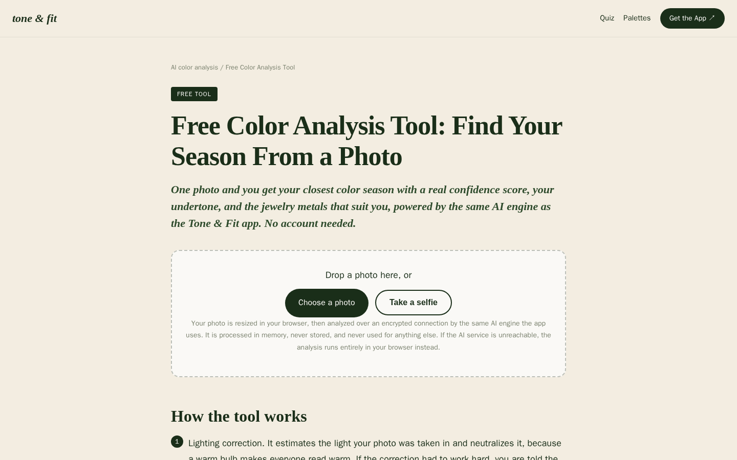
Desktop first-screen of the free web-based color analysis tool with photo upload drop zone, how-it-works steps, and privacy notes
If you want one more reference point, run a free Tone & Fit color analysis or download the app, and set its result beside the worksheet you built in daylight. Your eyes on your own clothes remain the final check.