True Autumn Color Palette Outfit Ideas for a Work Wardrobe
If your color analysis came back True Autumn — or Warm Autumn, on systems that use that name — you already have a palette. The question is no longer which colors suit you, but how to wear them to work. These true autumn color palette outfit ideas for a work wardrobe assume you have a result to build on: they skip palette construction and go straight to dress codes, outfit formulas, garment roles, accessories, and the constraints real workplaces create.
One caveat before the formulas: seasonal systems label things differently. Tone & Fit's autumn palette guide describes Warm Autumn as "also called True Autumn," and in other systems the same coloring may sit closer to Soft Autumn or Deep Autumn at the edges. Your result card is the authority. Treat everything here as a starting framework, not a verdict.
What this guide assumes about a True Autumn result
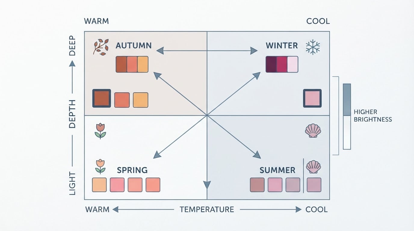
This guide assumes your result places you in the warm, rich, muted end of the color spectrum: colors with a golden base rather than a blue one, medium-to-deep in depth, and softened rather than neon. That is the family the 12-season system usually calls True Autumn or Warm Autumn. Seasonal systems vary in naming and granularity — four-season, 12-season, and 16-season systems all exist — so if your card says "Warm Autumn" and a friend's says "True Autumn," the two of you may simply be reading different systems that describe similar coloring. Individual preference matters too: a palette is a tool for decisions, not a uniform.
This guide is not about building a palette from scratch and not about first purchases for a general closet. It assumes you already know your colors and now need professional outfit decisions: which neutrals to anchor a work wardrobe on, which formulas repeat well across the week, and how to stay in-palette when a dress code pushes back.
Choose work-ready True Autumn neutrals first
Neutrals do the heavy lifting in a work wardrobe, so start there instead of with statement pieces. Tone & Fit's palette page lists the Warm Autumn anchors as camel, chocolate brown, warm ivory, olive, and warm navy — warm, medium-depth shades that pair with almost everything else in the palette. For workplaces, you can translate those into everyday garments this way:
- Camel for blazers, trousers, coats, and knitwear. It reads polished in tailoring and soft in knits.
- Chocolate or warm brown as the workhorse: trousers, skirts, belts, and shoes. It takes the place many wardrobes give to black.
- Olive and warm gray-green for trousers, utility jackets, and cardigans. They read neutral while staying warm.
- Warm ivory or cream for shirts, blouses, and knit tops, replacing stark white near the face.
- Warm navy for suits and blazers when you need a darker, more formal anchor than brown.
None of this is absolute. Treat the list as a starting point and compare each shade against your own result, because sub-season boundaries blur in practice. Tone & Fit's palette pages show hex codes for every Autumn shade family, which makes it easy to check whether a garment labeled "tan" or "khaki" actually falls inside your palette before you buy.
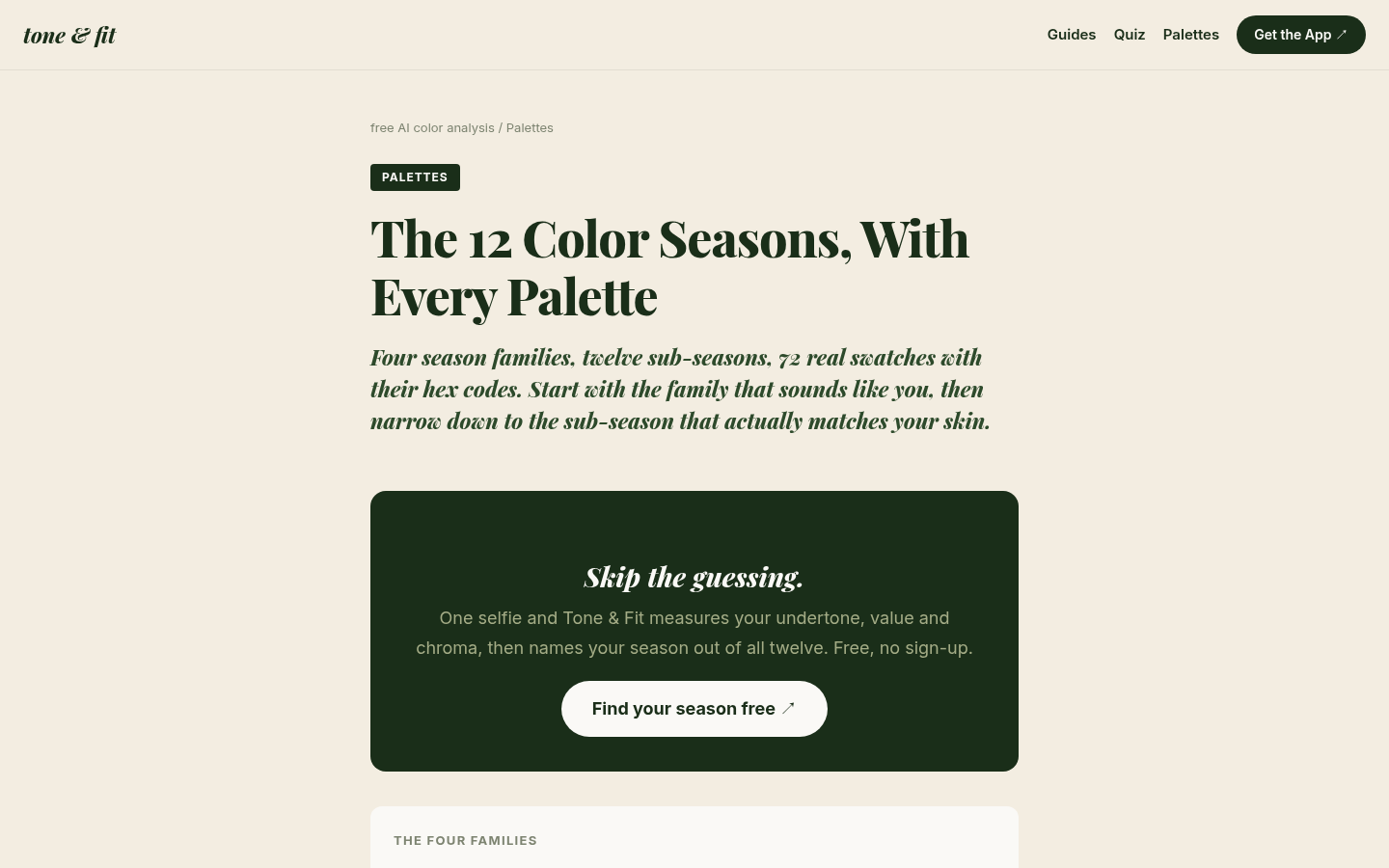
Desktop first-screen of the palettes index page showing season families (Spring, Summer, Autumn, Winter) with hex-coded swatches and sub-season links
Build repeatable two-color and three-color formulas
A small set of color formulas removes the daily decision. Two-color formulas are the fastest: pair one neutral with one palette color, keeping the neutral dominant in formal settings and letting the palette color lead in casual ones.
- Camel + rust: camel trousers or a skirt with a rust knit or blouse. Classic and reliably warm.
- Olive + mustard: olive trousers with a mustard top, or an olive blazer over a mustard shell.
- Chocolate + moss green: chocolate trousers with a moss-green sweater, or a chocolate skirt with a deep-green shirt.
- Warm navy + tomato red: a warm-navy suit or blazer with a tomato-red top underneath when you want a bolder read.
Three-color formulas add one more layer and give outfits a finished look. A dependable pattern is neutral base + secondary neutral + one accent, with the accent kept to the smallest visible area — a top layer, a scarf, or a pocket square. For example: warm-ivory shirt, chocolate trousers, rust blazer. Or: camel coat, olive dress, mustard scarf. Keeping two of the three shades in the same depth range (both medium, or both deep) is what makes the combination look intentional rather than random.
Outfit examples for four workplace contexts
The same formulas adapt to different dress codes by changing garment roles, not colors.
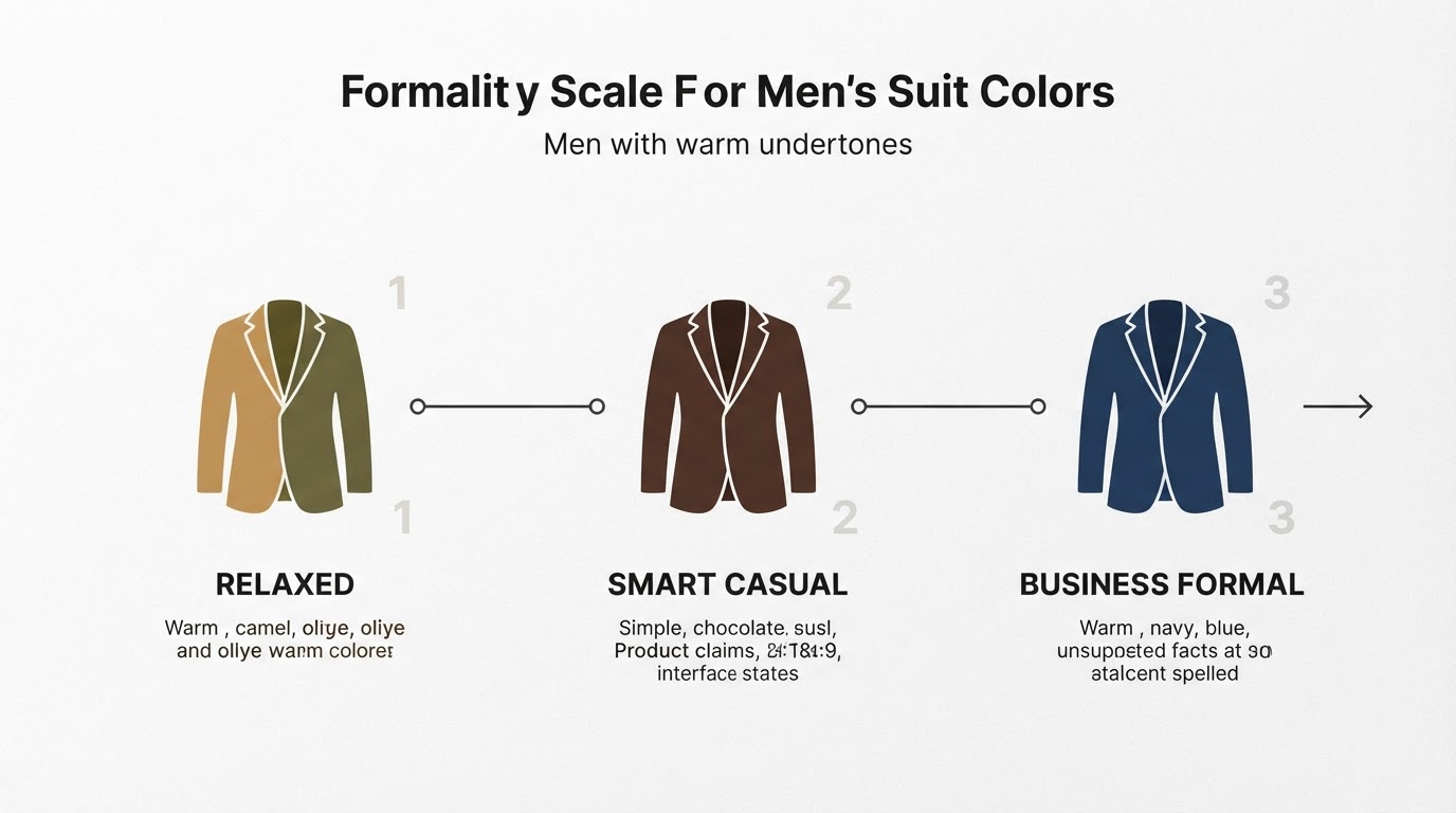
Formal offices. Suits, tailored dresses, and conservative tailoring. A warm-navy suit with a warm-ivory shirt reads as formal as a black suit while staying in-palette; chocolate-brown tailoring is the other strong option. For a skirt suit or dress, try a chocolate skirt with a cream blouse and a camel jacket. Ties and scarves can carry rust or mustard as the accent.
Business casual. This is where True Autumn neutrals shine. Camel trousers or chinos with an olive knit and a warm-ivory tee underneath; chocolate corduroys with a moss-green sweater; a rust shawl-collar cardigan over a cream shirt with camel trousers. Blazers in olive or camel upgrade any of these when a meeting runs more formal.

Creative workplaces. You can let the palette lead. Tomato-red trousers with a warm-ivory top, a mustard dress with chocolate boots, a teal blouse under an olive utility jacket. Rich accent colors read as intentional style rather than a dress-code violation in most creative offices.
Video calls. Cameras wash color out, so put your palette near your face: a rust, mustard, or moss-green top with a warm-ivory or camel layer reads clearly on screen, while dark chocolate or deep olive can read as near-black. Avoid thin stripes and busy patterns, which shimmer on camera, and check how the color looks under your actual desk lighting before the call. These examples work across gender presentations — the same formulas translate to suits, shirt-and-trouser looks, skirt-and-blouse combinations, dresses, and knitwear depending on what your workplace and preferences allow.
Use richer accents in adjustable amounts
Accents are how a True Autumn wardrobe stays interesting without breaking a dress code. Tomato red, mustard, coral, and warm green all belong to the family; the dial is the amount you wear. In formal settings, keep accents small and away from the largest surface areas: a tomato-red pocket square, a mustard scarf, a coral blouse under a neutral suit, or a warm-green knit visible at the collar. In business casual settings, let one accent own a whole garment — a mustard sweater, moss-green trousers — and keep the rest neutral. The trick is to adjust the amount, not abandon the color, so the same accent carries you from an interview to an off-site.
Coordinate shoes, bags, belts, and jewelry
Accessories either confirm the palette or quietly fight it. Leather goods in warm browns — chocolate, chestnut, tan, oxblood — coordinate with the neutrals above; if your workplace requires black shoes or bags, treat them as a constraint (below) rather than a rule to follow. Belts should match the dominant warm tone of the outfit rather than the shoes exactly. For jewelry, warm metals are the natural fit: yellow gold and copper are the metals Tone & Fit lists for the Warm Autumn palette, while bright silver or platinum tends to read cool against warm coloring. A copper watch, gold hoops, or a gold chain can be the finishing accent a neutral outfit needs.
Adapt for uniforms, required black, denim, and other constraints
Workplaces impose constraints, and none of them cancel your palette — they just move it around your body. The general principle: keep warm, muted colors near your face and let constraints live below the neck or in small areas.
- Required black. If black is mandatory (uniform trousers, a dress code, or a client-facing rule), keep it below the waist or in structured pieces like trousers and bags, and put your palette near your face with a rust, mustard, olive, or warm-ivory top. Black near the face is the part that usually fights warm coloring, which is why chocolate or deep olive is the recommended swap when you have the choice.
- Uniforms. Add palette-aligned accessories within uniform rules: a warm-ivory undershirt collar, a rust or gold-accented name badge lanyard, a copper watch, or palette-approved socks. If the uniform is fully fixed, small touches — jewelry, eyewear frames, a warm-neutral watch strap — still keep the look yours.
- Denim. Denim is a workplace staple in many casual offices. Warm-leaning washes — olive-tinted, brown-based, or medium indigo with a warm cast — sit closer to the palette than icy or gray-blue washes. If your favorite denim is cool-toned, wear it away from your face and pair it with palette tops.
- Other rules. Client-facing or conservative settings: keep accents small and garments structured. Uniforms with fixed colors: use the accessorizing strategies above rather than fighting the dress code.
Audit your current work wardrobe before shopping
Before you buy anything, spend an hour with your closet and your palette in hand. Pull every work piece you actually wear and sort it into three piles:
- Keepers: pieces already in your palette — warm neutrals, warm greens, rust, mustard, camel, warm ivory.
- Borderline: pieces that are close but cool-toned or too bright — black, stark white, icy pastels, cool grays. These are candidates for the constraint strategies above (wear below the waist, layer under palette colors, or keep away from your face).
- Gaps: the roles you are missing — no warm-neutral trousers, no olive layer, no camel blazer, no warm-ivory shirts, no warm-metal jewelry.
Write down the gaps. That list — not a trend article and not a full-closet rebuild — is your shopping plan.
A workwear shopping checklist by wardrobe gap
Buy to close gaps, one category at a time, in this order: neutrals first (they multiply everything else), then layers, then accents, then accessories.
- Neutral base gaps: one pair of camel or chocolate trousers; one warm-ivory shirt or blouse; one chocolate skirt (if skirts are part of your workwear).
- Layer gaps: one olive blazer or cardigan; one rust or mustard knit.
- Accent gaps: one tomato-red or warm-green top for formal days; one mustard or rust piece for casual days.
- Accessory gaps: one pair of warm-brown leather shoes; one warm-brown belt; one gold or copper watch or jewelry set.
- Constraint gaps: if black is required, one warm-ivory or rust top to wear with it; if denim is allowed, one warm-leaning wash.
A useful completion standard: when every keeper in your closet pairs with at least two other pieces into a complete work outfit, the wardrobe is doing its job. You do not need a big closet — you need a coordinated one.
No result yet? Run the free Tone & Fit color analysis
If you reached this guide without a confirmed result, start there instead of guessing. Tone & Fit's free color analysis tool takes one photo and returns your closest color season with a confidence score, your undertone, and the jewelry metals that suit you — no account needed, and the photo is processed in memory and never stored. The tool is powered by the same AI engine as the Tone & Fit app, which builds the full profile: your 12-season result, 40-plus named colors, colors to avoid, and palette guidance you can carry into the outfit formulas above. Once you have your result, come back to this guide and build the work wardrobe from a foundation you can trust.
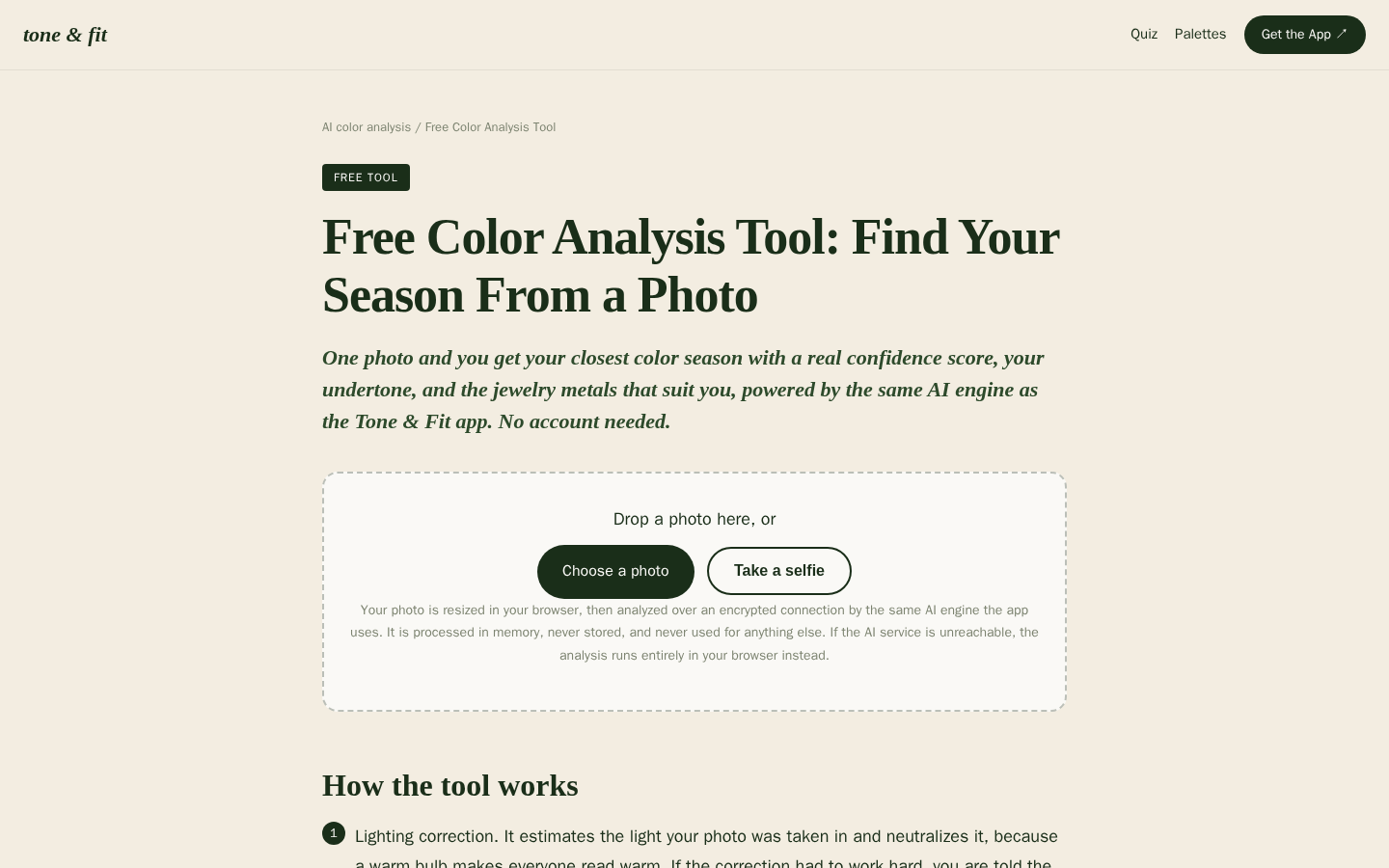
Desktop first-screen of the free web-based color analysis tool with photo upload drop zone, how-it-works steps, and privacy notes