Warm Autumn vs Deep Autumn at a glance
Decision | Warm Autumn (also called True Autumn) | Deep Autumn |
|---|---|---|
Dominant trait | Warmth: golden, earthy color organizes the palette | Depth: rich, dark color with warmth underneath |
Depth | Medium | Deep |
Chroma and contrast | Moderate intensity; medium contrast | Higher intensity; the palette supports more contrast |
Anchor neutrals | Camel, olive, warm tan, rust-brown | Espresso, chocolate, mahogany, charcoal-brown |
Metals | Rich yellow gold | Antique gold, bronze, brass |
Black | Often harsh; chocolate or deep olive usually works better | Often wearable, especially in matte fabrics |
First pieces to get right | Face-adjacent pieces in warm mid-tones | Face-adjacent pieces in deep warm neutrals |
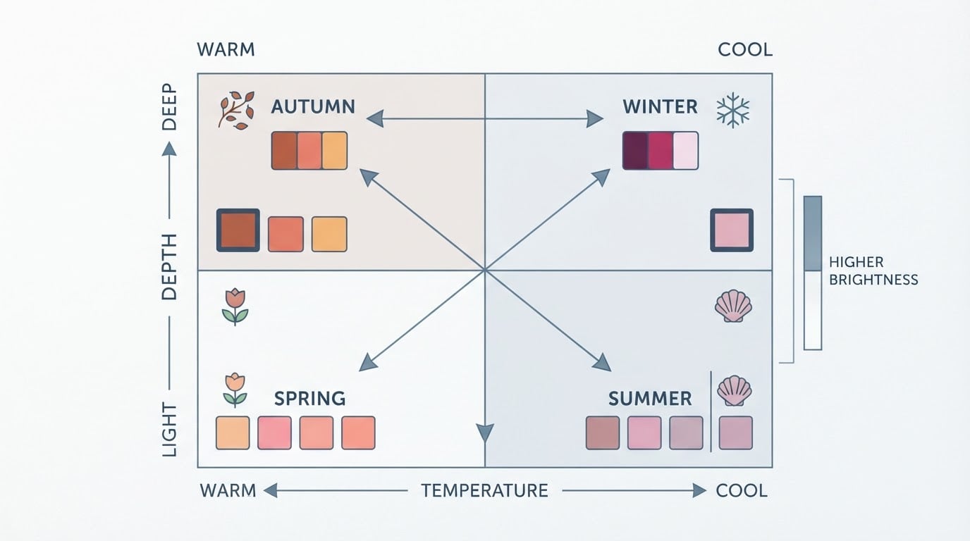
The two columns describe the same warm, earthy family. The disagreement is which variable leads: temperature in Warm Autumn, depth in Deep Autumn. That is also the practical question to answer — not which palette is correct, but which variable your wardrobe needs to solve first.
Naming adds confusion. Analysts trained in the Sci/Art method often call this palette True Autumn because warmth is its most prominent characteristic; other systems call the same palette Warm Autumn. Some guides use Dark Autumn for Deep Autumn. The colors described do not change when the label does.
What Warm Autumn and Deep Autumn share
Before the split, the shared ground matters:
- Warmth over coolness. Both palettes favor gold over silver, cream over bright white, and warm reds such as tomato, terracotta and brick over blue-based reds.
- Earth tones as home base. Browns, olives, rusts, moss greens and warm tans do the heavy lifting in both palettes.
- Depth over pastel. Icy pastels and powdery cool pinks tend to flatten an autumn wardrobe; both palettes work better with color that has some weight.
- Face-adjacent color first. Tops, scarves, glasses, earrings and makeup near the face change more than trousers, shoes or bags, so spend there first.
The four-season Color Me Beautiful system that brought this vocabulary into the mainstream in 1980 treated Autumn as a single category; later 12-season frameworks split it into Soft, Warm (or True) and Deep. The modern 12-season model added two extra measurements — depth and chroma, or color clarity — which is what makes the Warm-versus-Deep question possible in the first place (Palette Hunt's 12-season explainer, Colorito's history of the system).
The central distinction: warmth-led versus depth-led
Warm Autumn organizes around temperature. Warmth is the trait you notice first: golden, medium-depth coloring that responds to camel, terracotta, olive and copper. Depth is present but moderate, and the palette rarely needs to go dark to work.
Deep Autumn organizes around value. Depth is the loudest trait, and warmth stays underneath it. The palette runs to espresso, mahogany, dark teal, forest green, deep rust and warm burgundy. Deep Autumn coloring also tends to carry more contrast, which is why the palette can hold richer, more saturated color without the clothes doing all the talking (TruHue's side-by-side comparison).
Neither reading is better. If a warm mid-tone makes your skin look even but a very deep tone looks heavy, warmth is probably your lead variable. If deep, rich tones make your face look clear and mid-tones look washed out, depth is the lead.
Side-by-side neutral comparison: camel, chocolate, navy, charcoal and black
Neutrals decide most outfits, so compare them one at a time. These are comparisons to test, not rules.
Camel. Warm Autumn's signature neutral — a true golden camel in a knit or coat. Deep Autumn can wear camel, but it usually works as a lighter layer over a deep base rather than as the deepest color in the outfit.
Chocolate. Shared ground. Warm Autumn tends toward milk chocolate, chestnut and warm brown; Deep Autumn gets its version in espresso, bitter chocolate and mahogany.
Navy. Both palettes do best with a navy that reads warm or muted — ink, teal-leaning or slightly softened — rather than a crisp cool blue. Deep Autumn often finds true navy easy because depth already gives the contrast; for Warm Autumn, keep a crisp navy away from the face or warm it with a tan or olive layer.
Charcoal. Warm Autumn usually gets more from charcoal-brown or olive-charcoal than from a cool blue-gray. Deep Autumn can wear charcoal, and a charcoal with brown in it is the safest version.
Black. Deep Autumn frequently handles black, especially in matte wool, denim or leather. Warm Autumn often looks better in dark chocolate, deep olive or espresso. If black is non-negotiable, keep it away from the face or break it with a warm scarf or collar.
Side-by-side accent comparison: rust, mustard, forest green, teal, burgundy and aubergine
Rust. A shared signature. Warm Autumn wears brick and copper rust; Deep Autumn goes a step deeper into mahogany-rust and burnt sienna.
Mustard. Warm Autumn suits a rich golden mustard; Deep Autumn is better served by darker ochre or antique gold.
Forest green. Warm Autumn can use moss and olive-green; Deep Autumn takes the deeper pine and evergreen end.
Teal. Warm Autumn's teal leans green and soft; Deep Autumn's teal is dark and saturated.
Burgundy. Warm Autumn does well with a brick-leaning red and a lighter warm burgundy; Deep Autumn can carry deep oxblood and warm burgundy.
Aubergine. This one tilts toward Deep Autumn: dark eggplant and warm plum have the depth the palette asks for. Warm Autumn can still use aubergine as a bottom or accessory, with a warmer color near the face.
Clothing examples for casual, work and occasion outfits
The garment role matters more than the dress code. These examples are deliberately spread across styles, budgets and body presentations.
Casual. Warm Autumn: a camel overshirt or knit over an olive tee with warm tan trousers. Deep Autumn: a chocolate crew-neck or espresso denim jacket over an olive tee with charcoal-brown trousers. On a small budget, change the layer closest to the face first.
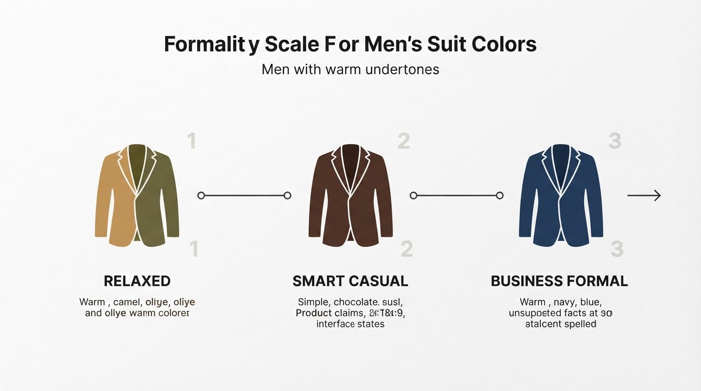
Work. Warm Autumn: a warm-brown or tan blazer with a cream shirt and olive trousers; in menswear, a warm brown or olive jacket reads sharper than a cool grey one. Deep Autumn: a charcoal-brown suit or jacket with a deep teal knit; deep navy also works when it is not icy. Both routes beat a cool black suit for most autumns.
Occasion. Warm Autumn: copper, rust or warm gold in a matte fabric. Deep Autumn: aubergine, burgundy or deep forest green with gold or bronze accents. If you are shopping second-hand or on a tight budget, one strong face-adjacent piece — a scarf, a top, a tie — usually changes more than a new pair of shoes.
Across genders and dress codes, the logic stays the same: choose the version of the color that matches your lead variable, then let the rest of the outfit stay quiet.
How fabric texture, print scale and color contrast affect the result
Color is only one part of how an outfit reads:
- Texture changes volume. Matte wool, linen and brushed cotton soften a color's edge; satin, shine and smooth leather push a color forward. A deep burgundy that feels wearable in matte wool can feel heavy in a high-shine fabric.
- Print scale changes contrast. Small, dense prints blend colors into a softer average, which suits more muted combinations. Large blocks and big prints raise contrast, which favors the palette that already carries more of it.
- The outfit total matters more than any single piece. A warm top with cool trousers is not automatically wrong; the question is whether the contrast between them looks intentional. Use one variable at a time so you can tell what changed.
A wardrobe test using garments you already own
This test borrows the logic of a controlled comparison. Do it in consistent indirect daylight — a north-facing window rather than direct sun — with clean, bare skin and no heavy makeup. Test the same way twice on different days before you trust the result.
- Pick two pieces. One warmer medium-depth color (camel, rust, olive or terracotta) and one deeper neutral-warm color (chocolate, espresso, deep olive or mahogany). Matte fabrics work best for the first pass.
- Hold each one under your chin. Use the same shirt underneath, hold each piece for ten to fifteen seconds, and step back about a meter from the mirror. Notice which one you stop seeing — the color that quiets down rather than the one that pops.
- Change one variable at a time. First compare warm versus cool at the same depth. Then compare medium versus deep at the same warmth. Then compare muted versus saturated. Keep everything else identical.
- Record a preference, not a verdict. Note which version looked calmer and which one drew your eye to the color first. A photo can help you remember the order you tested, but do not diagnose a season from a single photograph.
- Repeat on a second day. If your preference flips, the difference between the two versions is probably small, and you may be sitting between the palettes.
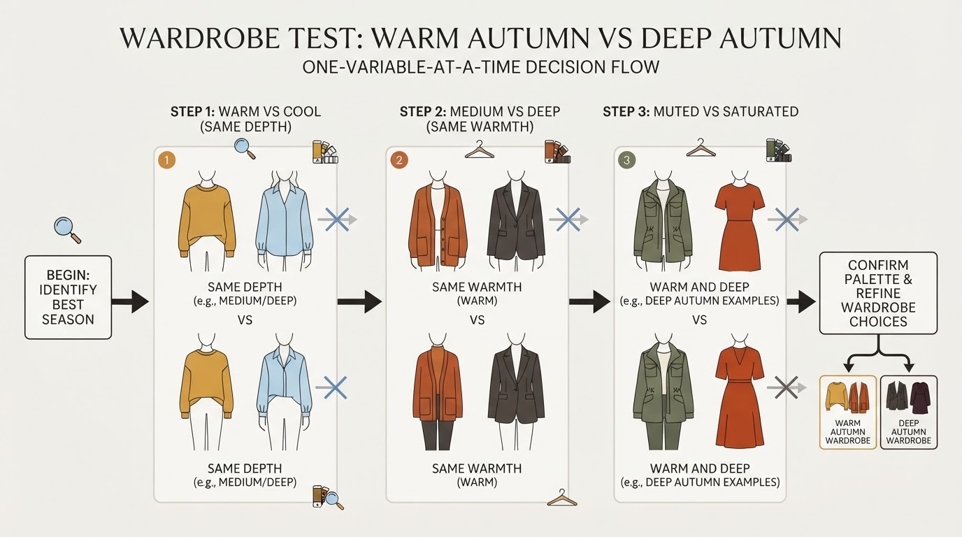
You are finished when you can state which variable you changed and which version you preferred in both sessions. That statement is useful wardrobe evidence; it is not a clinical result.
What to do when both palettes seem workable
Many people land between two adjacent sub-seasons, and the sub-seasons sit on a spectrum rather than in sealed boxes. If both versions look workable, you have two sensible options.
Build a shared-core wardrobe: warm browns, deep greens, rusts, olive and cream that both palettes claim, then choose the face-adjacent pieces from whichever version won your test. This keeps most of your wardrobe useful even if your season label later changes.
Or set one tie-breaker rule. If black usually works for you and deep tones make your face look clear, lean Deep. If black always feels harsh and camel, olive or rust feel like home, lean Warm. Let the test you ran decide, not the label on a quiz result.
How to create a small shopping shortlist after the comparison
After the comparison, keep the list short. Three slots are usually enough:
- One face-adjacent top, scarf or tie in your winning version of rust, teal or burgundy.
- One outer layer in your anchor neutral — camel for a Warm Autumn lean, espresso or charcoal-brown for a Deep Autumn lean.
- One bottom or shoe in a neutral you already wear, adjusted toward the warmer or deeper version.
Check each candidate near your face in daylight before buying, and prefer one well-chosen piece over four compromises. Once the subtype question is settled, the broader planning tools take over: the general seasonal shopping guide, our capsule-wardrobe guide, and — if you already know you are a True Autumn and want professional outfit formulas — the True Autumn work-wardrobe guide.
Frequently asked questions
Is Warm Autumn the same as True Autumn? In most 12-season systems, yes. Sci/Art-trained analysts use True because warmth is the dominant trait; other systems use Warm for the same palette.
Can someone sit between Warm Autumn and Deep Autumn? Yes. Adjacent sub-seasons overlap, and many people wear colors from both. The overlap zone is the warm, medium-to-deep end of the autumn family.
Can Deep Autumn wear black and camel? Black is often workable for Deep Autumn, especially in matte fabrics; camel is workable as a lighter layer. Warm Autumn usually has an easier time with chocolate than with black.
Does hair color or eye color decide the subtype? No. Hair and eye color are useful observations, but a season is not diagnosed from ethnicity, eye color, hair color or a single photograph.
Do I need a professional analysis? Fabric draping with a trained analyst is the most accurate method. At-home tests give you a useful read on temperature first, then depth and chroma — enough to shop better, not enough to certify a season.
Does this comparison work for men? Yes. Menswear runs on a narrow band of navy, gray, olive and brown, so choosing the right warm or deep version of those colors does a lot of work with very few pieces.
A practical next step
This guide is published by the team behind Tone & Fit, which also offers a free color analysis and an iPhone app, so treat the following recommendation as a related resource rather than an independent review.
If you want a second reference point, Tone & Fit offers a free color analysis tool plus a free palette library that covers all 12 sub-seasons, including Warm Autumn and Deep Autumn.
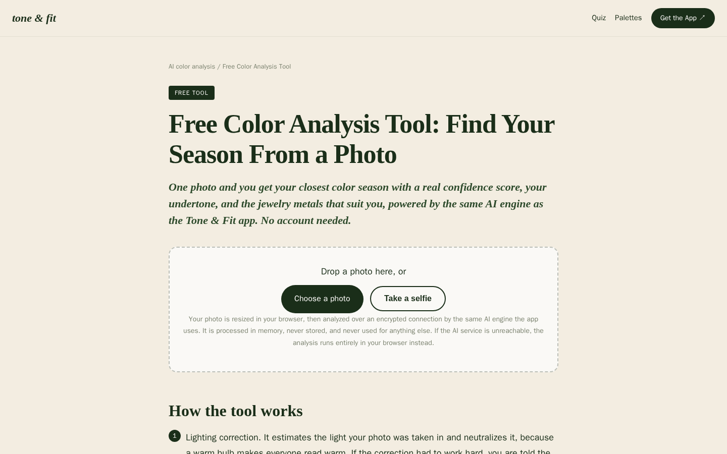
Desktop first-screen of the free web-based color analysis tool with photo upload drop zone, how-it-works steps, and privacy notes
Run the test above first. Then use the reference palette to check the pieces you already own — that order keeps the palette a tool, not a verdict.