What a warm-undertone result can and cannot determine
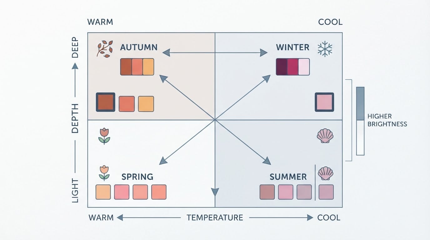
A warm-undertone reading describes where your skin sits on the warm-to-cool axis: golden, yellow or peachy rather than pink or blue. That single fact is useful, because it tells you which version of a color to reach for first. Cream instead of icy white. Camel instead of dove grey. Terracotta instead of fuchsia. A warmer version of a shade usually sits more quietly against warm skin than its cooler twin.
It does not tell you how light or deep your best shades should be, and it says nothing about how muted or bright they can get. Those are separate variables — depth, chroma and contrast — and together they change the answer more than warmth alone. Two people can both read warm and need completely different versions of the same red. Warm undertone is a filter for the shortlist, not a verdict on any single color.
Why brown skin is not one depth, undertone or contrast level
"Brown skin with a warm undertone" covers a wide range. A light golden-tan complexion and a deep espresso one share a warm cast but almost nothing else about how color behaves on them. A warm cast also shows up differently from person to person: golden-olive, peachy-golden, red-brown, or a warm neutral that sits close to olive. Treating that range as one palette is the most common reason a color recommendation fails.
Depth changes how a shade reads. A pale top creates strong contrast against deep skin, while a deep brown can nearly disappear into it. On lighter brown skin, very pale shades can flatten the face unless something deeper grounds the outfit. Chroma matters too: muted warm coloring tends to look more at ease in softened, dusty versions, while brighter warm coloring can carry clearer, more saturated shades.
Contrast level — how your hair and eyes sit against your skin — decides how you combine colors. A low-contrast complexion often looks best in tone-on-tone outfits, while a higher-contrast one can handle a light top with a deep bottom. None of these is a rule you have to obey; each one is a variable you can test.
Start with versatile neutrals
Neutrals do most of the work in a wardrobe, and warm ones are easy to test because you probably already own a few.
- Cream and oatmeal instead of optic white. Cream sits closer to warm skin, so the face stays the focus. If cream reads too soft, a warm off-white with more body is the middle step.
- Camel, caramel and tan. Mid-tone warm neutrals that work as a jacket, trouser or knit. On deep skin they create a visible contrast; on light brown skin they can blend into a quiet, tonal look.
- Chocolate and espresso browns. Deeper warm neutrals. A rich brown coat or trouser often does the job people expect black to do, with less harshness next to warm skin.
- Warm navy. Navy with a touch of warmth rather than a blue-black. It reads as a dark neutral in daylight and pairs with almost everything else on this list.
- Olive. A green-brown neutral that behaves like a neutral while adding interest. Olive bottoms with a cream or camel top is one of the most repeatable warm combinations.
- Softened darks: charcoal and deep warm grey. Useful when you want a dark base without black's hard edge. Test black and charcoal side by side in daylight; many warm-undertone readers keep black for shoes and bags and wear charcoal near the face.
Neutrals are the backbone, not the whole wardrobe. Notice which ones make your skin look even, and use those as the base for the color families below.
Compare warm reds, oranges and yellows
Warm reds, oranges and yellows are the easiest families to overgeneralize, because each one spans light to deep and muted to bright.
Reds run from soft salmon and brick through rust and terracotta to deep burgundy and oxblood. The warm test is whether the red looks brown-orange at the edges rather than pink-blue. Deeper warm skin often carries deep brick and burgundy with ease; lighter warm skin may find medium brick or a softened rust more workable than a heavy oxblood.
Oranges move from apricot and peach through amber and burnt orange to pumpkin. This family is where intensity matters most. A muted burnt orange behaves very differently from a clear, sharp orange, and the softer version usually suits a muted complexion better. If orange feels loud, amber and terracotta are the same family at lower volume.
Yellows run from butter and honey through gold and mustard to saffron. Pale yellow is often the hardest to wear near the face because it sits close to skin in depth; mustard and gold carry more contrast. For deep brown skin, a deep gold or bronze-yellow can read almost like a neutral; for lighter brown skin, honey and soft mustard often sit better than bright lemon.
Compare greens, blues and purples
Warm undertone does not limit you to earthy colors. It changes which version of a blue, green or purple you compare, and depth and brightness still decide the rest.
Greens: olive, moss, forest and deep emerald are the classic warm-leaning greens. Sage and softer khaki work when you want a muted version, while teal and peacock green add brightness without turning cold. Chartreuse and lime are the bright end — test them in a small dose before committing to a full garment.
Blues: warm navy and teal are the safest entry points, with petrol and peacock blue close behind. Denim blue is a practical everyday warm-adjacent blue. Bright cobalt and turquoise can work well, especially on deeper skin or as an accent, while icy pastel blues are the versions most likely to look separate from a warm complexion.
Purples: plum, aubergine and warm violet sit naturally with warm undertones, and berry tones bridge purple and red. Mauve can work when it leans warm rather than grey-blue. If purple has felt wrong before, the problem was often a cool lavender, not purple itself.
Choose colors by depth, brightness and preferred contrast
Three decisions replace one long list of rules.
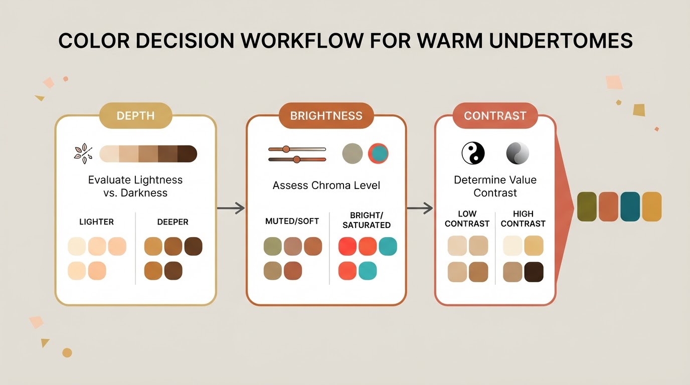
- Depth. First, decide whether you want the garment to match your skin's depth or contrast with it. Matching depth gives a blended, tonal outfit; contrasting depth gives a sharper look. Neither is better — pick per outfit.
- Brightness. Next, decide how much chroma the look needs. Muted shades sit quietly; clear shades announce themselves. Most wardrobes need both, used in different proportions: muted for large pieces, brighter for accents.
- Contrast. Finally, decide how many steps of contrast the outfit should have. High contrast is a light top with a deep bottom. Medium contrast is cream against chocolate. Low contrast is camel against tan.
Run the decisions in that order for any new color: is this the right warmth, the right depth, the right brightness, and the contrast I actually want today? A color that fails one question can still work if the other three are right — a bright shade as a scarf, for example, rather than as a full suit.
Five repeatable outfit formulas
Treat these as templates: swap the named pieces for whatever you own at the right depth and brightness.
Casual, blended: oatmeal knit + olive trousers + tan shoes. Low-to-medium contrast, easy to repeat on a work-from-home day.
Casual, higher contrast: cream top + chocolate trousers + rust overshirt. The light top and deep bottom create structure.
Work, classic: warm navy blazer + cream shirt + camel trousers + brown leather. A warm-toned alternative to the grey-and-white office uniform.
Work, tonal: chocolate blazer + camel knit + cream trousers. All warm neutrals, no hard lines, useful when you want to look considered rather than formal.
Occasion: deep espresso or plum base + cream contrast + one gold or amber accent. Keep the accent to one piece — a scarf, a bag, a pair of earrings — so the deep base stays dominant.
For each template, the variables are the same: a neutral base, a family color at your chosen depth, a contrast layer, and one accent. Change any single variable and the formula still holds.
Run a controlled daylight comparison at home
This is the test that turns a shortlist into a decision, and it needs no shopping.

- Stand at a window in indirect daylight, with no direct sun on your face and no artificial light mixing in. The same spot and time of day makes results comparable.
- Pick one garment per candidate color. Hold each at your collarbone, in the same position, and look at your face rather than the fabric.
- Compare two colors at a time. Ask the same four questions for each: Is the skin around my mouth and nose even? Are shadows under my eyes and along my jaw softened or deepened? Do my eyes look clearer or flatter? Do I see the color first or my face first?
- Keep the winner and repeat the pair in a second daylight session on another day. A color that wins twice is a keeper; a color that wins once and loses once gets another test, not a verdict.
Completion check: you are done when every candidate is labeled keep, test or skip, and at least one pairing has repeated the same result across two sessions. If nothing wins from a family, change the depth before rejecting the family — a medium brick that fails does not rule out a deep brick.
Build a keep, test and skip list
Turn the results into a shopping filter you can carry in your phone.
- Keep: colors that passed twice. Write them precisely — "muted warm brick, medium depth" is more useful than "red".
- Test: colors that partly worked. Note what to change: lighter, deeper, more muted, or as an accent rather than a main piece.
- Skip: colors that consistently flattened your face or cast odd shadows. Record why — too cool, too bright, too pale — so you stop re-buying the same mistake in a new cut.
Review the list when something changes: a new hair color, a weight change, or a shift in what you want to wear. A wardrobe shortlist is a living document, not a permanent label.
When to reassess an undertone label
Reconsider the label if your controlled tests keep contradicting it, if your hair color has changed enough to shift your overall contrast, if you relied on indoor light for the original reading, or if two quizzes gave different answers. None of those means the first result was wrong — it means the evidence is thin.
Tone & Fit is an AI color analysis app that reads undertone, contrast and chroma from one selfie in about 30 seconds and matches you to one of 12 color seasons. The scan is free and needs no account. There is also a free web analysis tool: one photo returns your closest season with a confidence score, your undertone and the jewelry metals that suit you. The photo is resized in your browser and processed in memory rather than stored. The result is a second reference point to compare with your own drape tests, not an accuracy promise. If the analysis and your wardrobe tests agree, act on it. If they disagree, that is a reason to test more carefully, not proof that one of them is wrong.
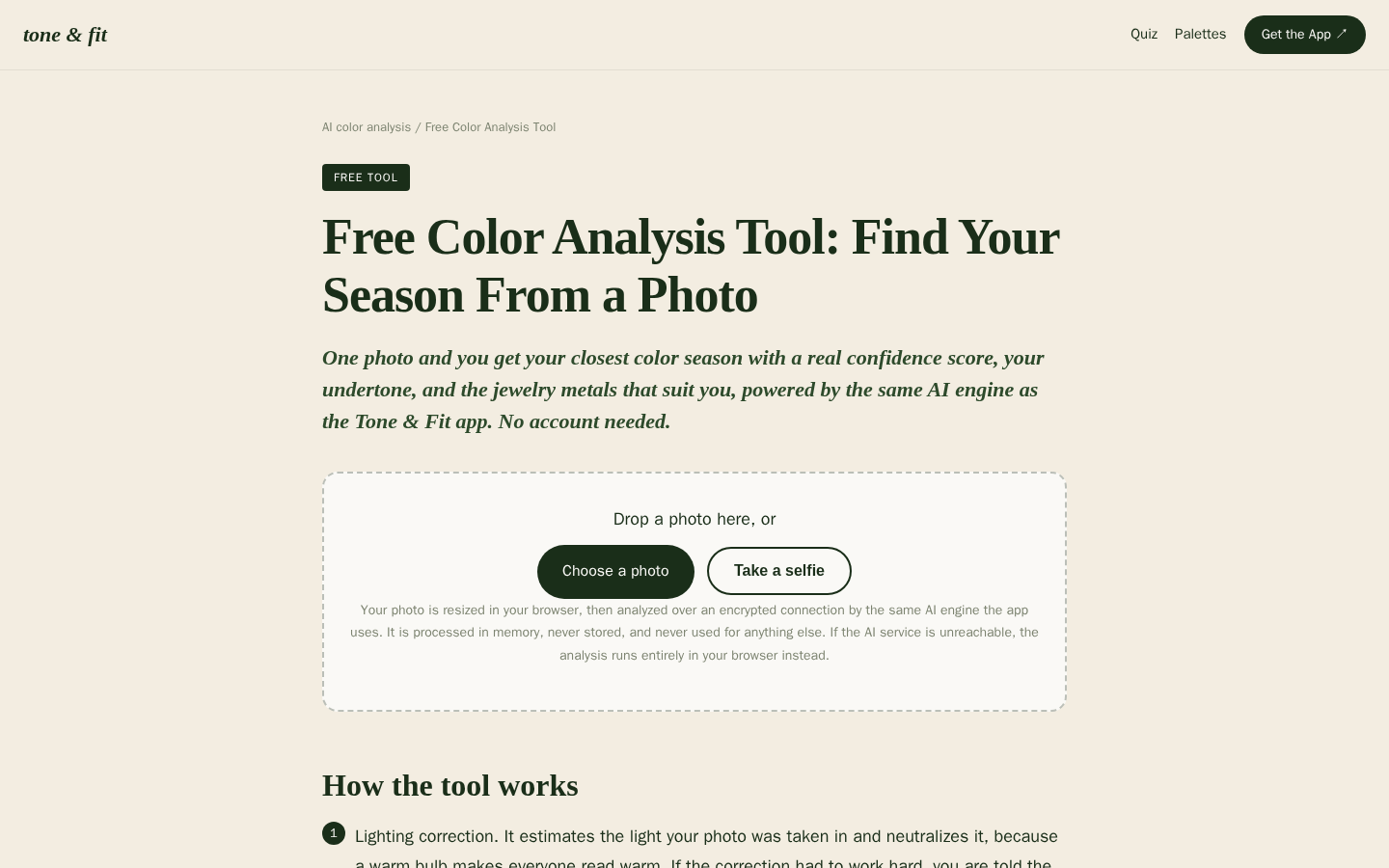
Desktop first-screen of the free web-based color analysis tool with photo upload drop zone, how-it-works steps, and privacy notes
If you want that second reference point, run the free Tone & Fit analysis or download the app.